Review: Ruby Hibiscus Water Goes Sparkling
Covers Products: Blood Orange Sparkling 2022, Concord Grape Sparkling 2022, Unsweetened Sparkling 2022
The follow up to its non-carbonated hibiscus beverages that launched in 2020, Ruby’s new line of organic sparkling drinks in 12 oz. cans come in three varieties: Unsweetened, Concord Grape and Blood Orange.
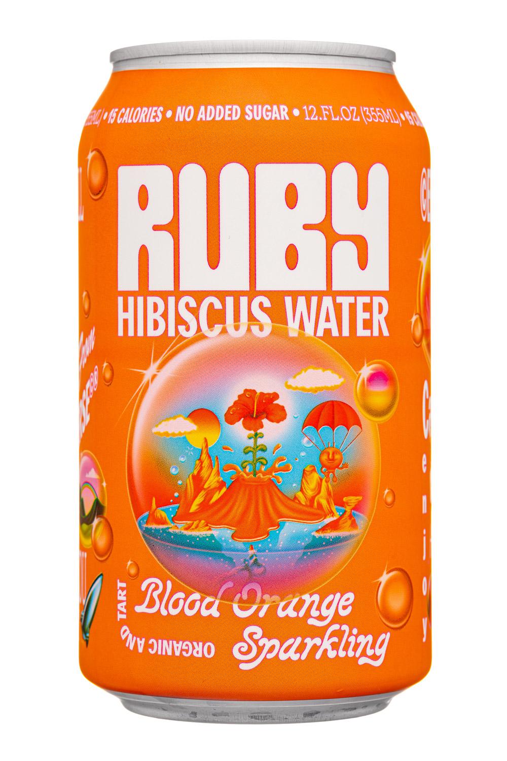
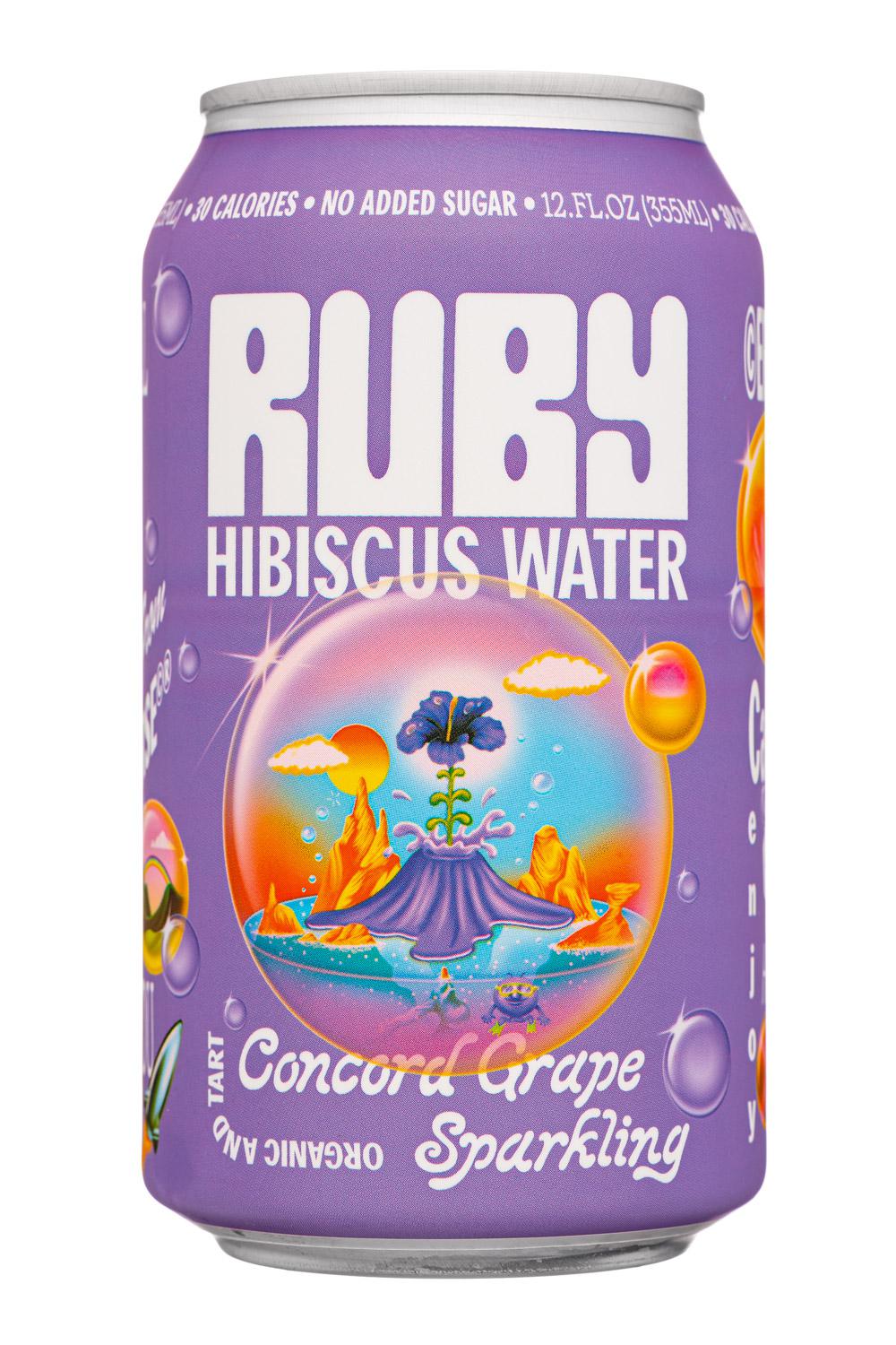
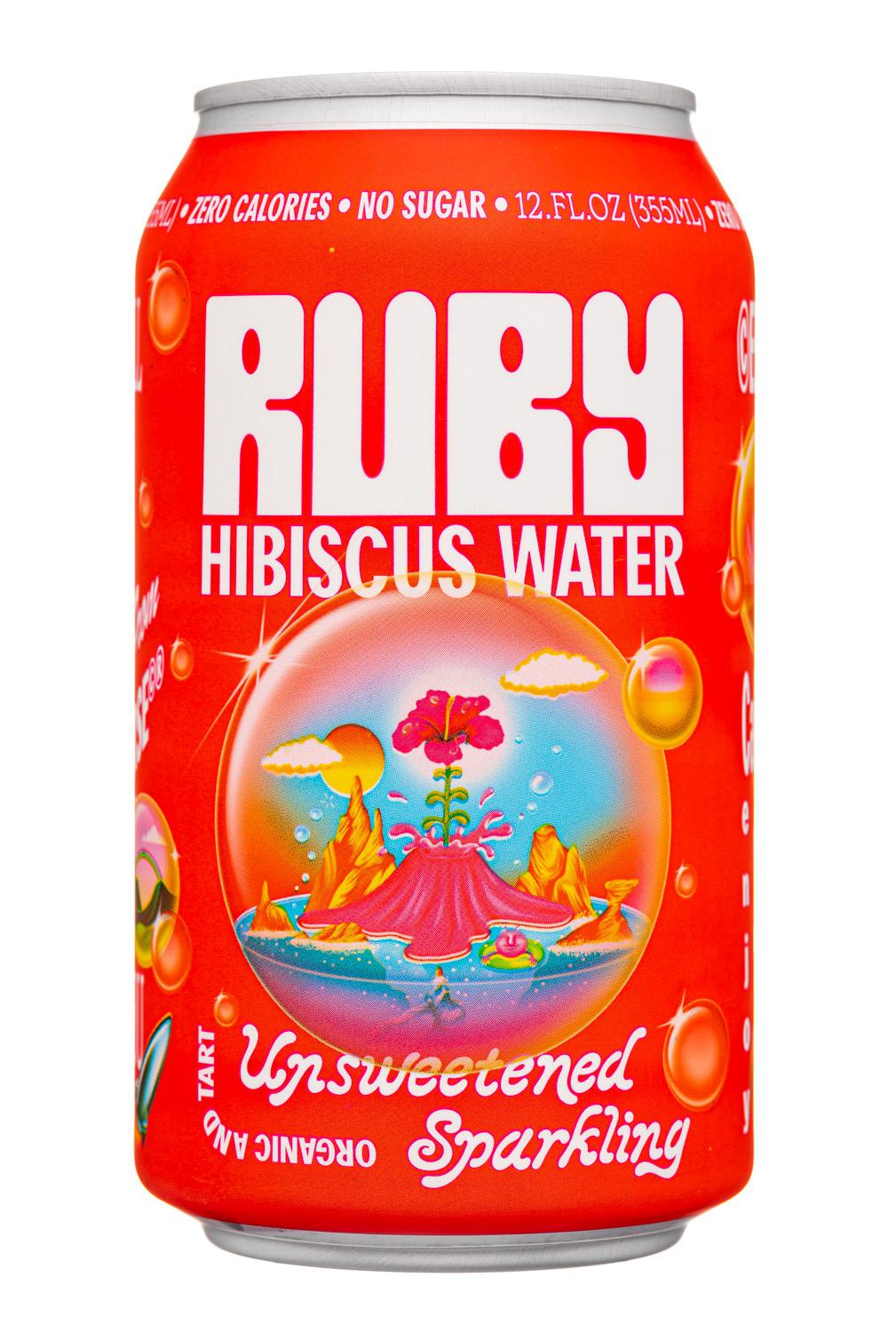
The products use a very clean and short list of ingredients, starting with a base of sparkling water and hibiscus. For the Unsweetened variety, this is the end of the ingredient list; as a result, the product has zero calories and zero sugar. Blood Orange contains added blood orange and orange juices (9% juice) and has 15 calories and 3 grams of sugar (from the juice). Finally, there’s Concord Grape, which contains 3% juice from added concord grape juice concentrate.
When it comes to flavor, all three of these SKUs are, as expected, hibiscus forward. Compared with the non-sparkling line, the added carbonation definitely gives the product a lighter mouthfeel and helps make the hibiscus a bit less tart. This in turn makes the product easier to drink and should help Ruby expand its potential consumer base.
This is particularly true with the fruit flavors, which add some light sweetness and additional layers of flavor. While the Unsweetened will serve the purists, these flavors feel like the direction that Ruby should pursue.
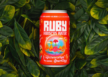
On the outside, Ruby has gone with a shrink sleeve label with a glossy finish. We’d describe the look of the product as whimsical and fun with a lot more personality than Ruby’s glass-based line. Plus, unlike the bottles that have an identical red backdrop from the liquid, these products each have their own visual identity.
The design centers around the concept of “The Rubyverse,” which uses retro style space images and fonts to create something that is playful and oddly inviting. Each flavor has its own background color while the format of the label is consistent across the three. This starts with a large white Ruby logo and “Hibiscus Water” tagline that sit near the top of the front panel. Below this is an image of what we assume is the Rubyverse – a cartoonish landscape of a volcano with a hibiscus flower coming out of it and the whole thing is wrapped inside a carbonation bubble.
The rest of the can has many text elements sprinkled throughout. This includes important informational text (package size, calories content, no added sugar) that’s placed around the top of the can while the flavor name is at the bottom and is set behind the Rubyverse bubble. On the back of the can, there’s more text, but thanks to good layout the unstructured approach still manages to catch your eye with the key attributes.
All in all, the look that they’ve created definitely stands out, creates some visual intrigue with its seemingly random space theme, and just looks cool in your hand. Really, the only thing we question about this product is the word “water” in the name – especially since it has a visual disconnect from the word “sparkling.” Tightening these up would be helpful for the brand’s ability to communicate its value proposition quickly.
Overall, Ruby’s sparkling offering is a smart and well-executed move for the brand. The product concept is stronger as a sparkling beverage and they’ve done a nice job creating something that is both enjoyable and innovative.