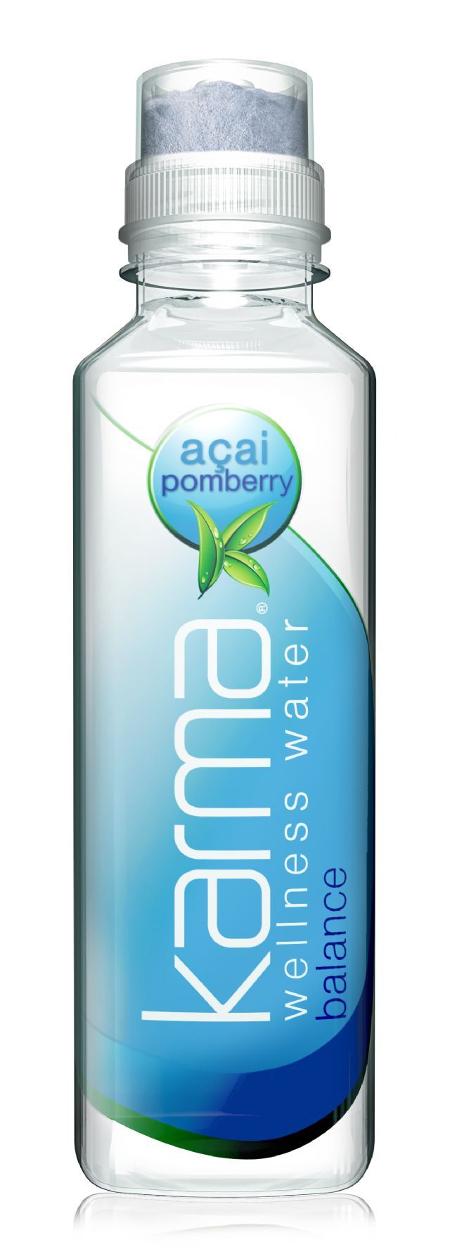
Karma Wellness Water: Acai Pomberry
by Karma Culture LLC
Product Type
Container
18 oz PET
Nutritional Info
Nutritional information is not available for this product.
Ingredients
Ingredients are not available for this product.


Review: Acai Pomberry
Posted: Sep 09, 2011 at 12:00 AM
(Last Updated: Sep 16, 2011 at 1:53 PM)
The latest entry into the cap dispensed enhanced water category (if such a thing exists) is Karma Wellness Water, an “acai pomberry” flavored product. The 18 oz. bottle starts out with a rather simple look, which is largely due to the plain spring water inside the bottle. The cap is where all of the flavor and functionality lies and, compared with other cap technologies that we’ve tried, this one is fairly simple: just press the top. This releases the blue colored powder, which keeps all of the nutrients in tact until the time of consumption (otherwise, they’d deteriorate in the water). After a light amount of shaking to mix the drink, all you have to do is remove the cap and drink away. The liquid, which turns a murky blue color, tastes like a blue raspberry flavored enhanced water, which should be a familiar flavor for more people. The drink is primarily sweetened with stevia, but it also has a touch of sugar. All in all, it definitely tastes like a diet drink, but it still manages to have ample sweetness. Functionally, the product has loads of vitamin C (1,000mg) , E, D, A, and B vitamins as well as added tea polyphenols, acai extract, cranberry extract, and pomegranate extract. Since they are trying to position this as “wellness water,” the formulation seems to make sense in that they have all of the basic vitamins covered. However, from a positioning point of view, “wellness” and “balance” (also mentioned on the front panel) are rather vague and conceptual relative to other functions like energy, relaxation, or hydration. Plus, there’s something about murky blue colored liquid and the words “wellness” and “fresh” that seem out of sync to us. Eliminating the blue color would certainly help remedy this. Overall, it’s a good start and we really like the cap dispenser that they’ve chosen, but cleaner label design (the front panel is fine, but the sides and back are very busy) and some other flavors would make us like it more.