Suerte Tequila is introducing an updated packaging design as the brand continues to see significant momentum—particularly with the strong performance of its 1L bottles in bars across key Suerte markets, including Colorado, California, Texas, Florida, New York, Georgia, Tennessee, and Oklahoma.
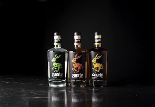
While the original screen-printed glass bottles were a long-standing visual hallmark for the brand, the minimalist design proved challenging to read from a distance, whether on crowded retail shelves or across a busy bar. In response, Suerte has debuted a bold black label crafted to enhance visibility, legibility, and overall presence in high-traffic settings.
The tequila itself remains untouched. Suerte continues to deliver the same award-winning liquid, slow-cooked agave, and iconic rabbit emblem that have defined the brand since its inception. The refreshed packaging offers a more contemporary, eye-catching presentation that better supports the brand's growing footprint in both on- and off-premise accounts.
The new look will begin rolling out on shelves and back bars in the coming weeks, offering consumers a clearer, more instantly recognizable way to spot Suerte in the wild.
For More Information:
Learn More
Stay Informed, Stay Competitive
Unlock the articles, expert interviews, and data reports that power the food and beverage industry. Join our community and stay ahead with exclusive insights from BevNET and Nosh.