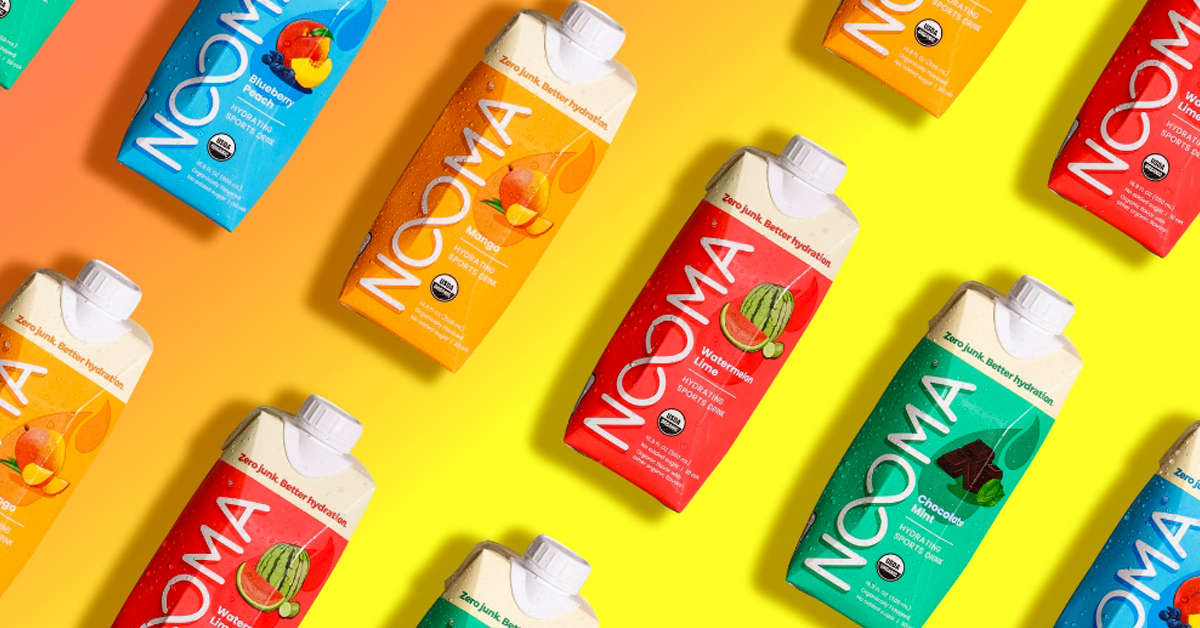
After a nine-month long process, sports and energy drink maker NOOMA has refreshed its packaging for the first time in the brand’s nearly 10 year run as it sharpens its clean label ingredient list and continues to build brand awareness online. The new design aims to create a “fun and inviting package” that communicates with its fitness-oriented consumer base by calling out the value propositions of NOOMA’s three ready-to-drink beverage formats and its powdered product.
“I don’t think consumers were necessarily making that connection in the two seconds that they saw it on the shelf,” said cofounder Jarred Smith of the brand’s previous, more simplistic design meant to echo the drinks’ short ingredient list. “And so it kind of fell short in selling itself and getting someone excited to give it a try.”
Smith and his brother Brandon, both former collegiate hockey players, launched NOOMA in 2013 as a clean-label, organic sports drink. In December 2019, the Cleveland-based company branched out by releasing a 4-SKU, coconut water-based pre-workout energy line that included lion’s mane mushrooms, ginseng, maca and green coffee extract. The company followed that in July 2020 with hydration powder mixes and, in June 2021, a Recovery Soda (Cherry Cola, Fruit Punch, and Coconut Lime) featuring immunity-boosting and stress relief ingredients like vitamin C, zinc and ashwagandha.
After nearly a decade on the market , NOOMA’s team began to strategize around a brand refresh last year to more clearly tell its story to consumers.
Better defining its newest product, Recovery Soda, with more descriptive branding was also a priority: “Recovery” has been swapped out for “wellness” in messaging around that line. Internally, the company had already been calling it a “wellness cocktail” and decided the brand refresh offered an opportunity to shift the functional soft drink’s name closer to that idea.
“The issues that we really started to see was that a lot of people have a predefined definition of what recovery is. It was a very loaded word,” Smith said.
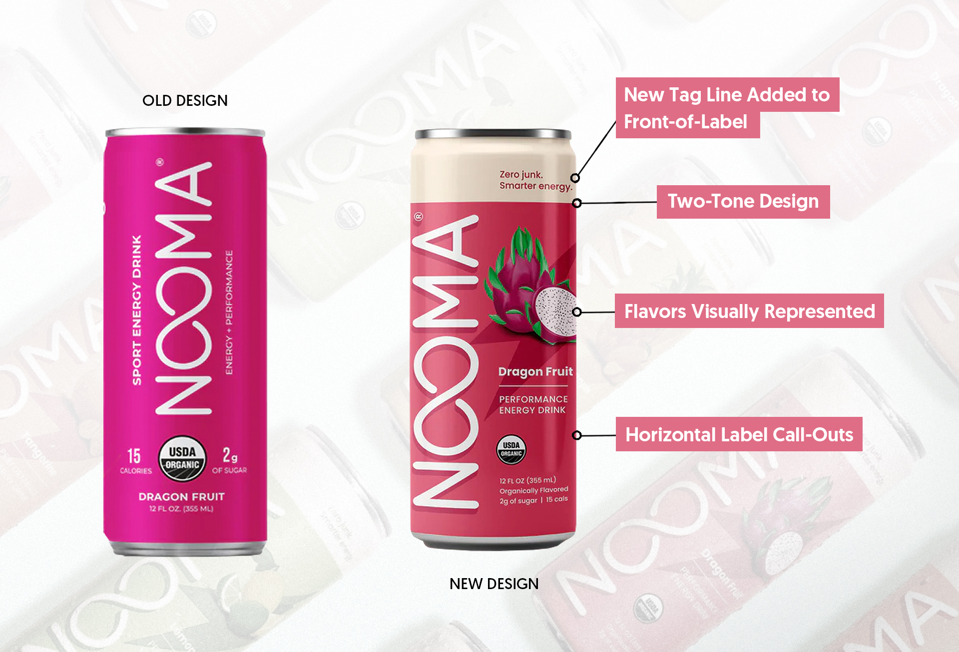
All three RTD lines also now feature both visual cues and text to guide consumers through each drink’s flavors and use occasions. A new tagline (“Zero Junk”) has been added to the top of each label with a product specific descriptor – Smarter Energy, Better Hydration and Bubbly Benefits.
The idea is to tie NOOMA’s multiple functional offerings together, Smith said.
“If you are coming to NOOMA, you know you’re gonna get a clean label, you’re getting that organic, plant-based product.”
Consumers are unlikely, however, to find NOOMA’s new package in stores, as the company is pulling back resources from retail to focus on ecommerce via D2C and Amazon. Currently, NOOMA’s current brick-and-mortar footprint is about 1,000 locations, split evenly between gyms and traditional retail channels.
“It’s the right stepping stone for us,” Smith said. “At this point, that is the way that we can really bring significant brand awareness that can then allow us to be successful with retail partners, especially those bigger ones going forward.”