The better-for-you soda space has come a long way, in only a little time.
When Mayawell first began building the identity for its prebiotic better-for-you soda in 2019, the category was still fairly nascent with no well-established leader and minimal consumer understanding. Now, only four years later, the rise of brands like Olipop and Poppi has familiarized consumers with the concept of a better-for-you, gut health-friendly beverage.
That turning point in consumer familiarity has allowed Mexican-owned, agave-based beverage brand Mayawell to lean into its product’s more compelling attributes, said Oliver Shuttlesworth, co-founder and CEO, while moving explanations about gut-health products onto the back burner.
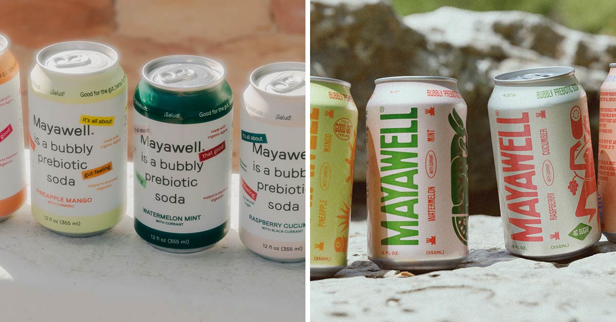
The impetus for the overhaul had been percolating for some time, he said, but whenever the brand received negative feedback about its packaging, it was never actionable or specific. One retail buyer was finally able to articulate the issue, Shuttlesworth said, and then “it just clicked.”
“It’s not that I don’t like the packaging, it’s that you’re calling out ‘bubbly prebiotic soda’ extremely prominently – but that category now already exists,” Shuttlesworth said while recounting the conversation with the unnamed buyer. “If you fit in that category, I don’t know that [the label] is doing what you want it to do, or as much as it could be anymore.”
The team kicked off the brand refresh efforts in April and will begin rolling out the new look in the coming weeks. Here’s what Mayawell is prioritizing on its new pack:
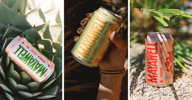
- Connection to Mexico: this spans the businesses’ ownership, key investor, hero agave ingredient as well as the basis for the liquid’s formula, which was inspired by the traditional beverage pulque.
- Agave’s functional role. That includes serving as both a sweetener and the prebiotic fiber (4 grams of sugar and 5 grams of fiber per 12 oz can).
- Brand identity. Previously the Mayawell name was lost among the product information, now, alongside the flavor callouts, consumers can quickly differentiate the brand from the product type and flavor.
- Heritage. Iconography on the new package is intended to better reflect each flavor’s ties to Mexican culture. The icons also embody the inspiration for the brand’s name, which stems from Aztec deity Mayahuel, who was often associated with pulque.
Shuttlesworth said keeping an open feedback loop was essential throughout the brand refresh process, while noting it was also necessary to balance differences of outside opinion with the co-founders’ vision for the brand: “Our goal was always [to look at the refresh] at a higher level. At that high level I think we’ve received really good feedback but it’s very easy to get lost in the weeds.”