

On the Brightside Feel-Good Soda
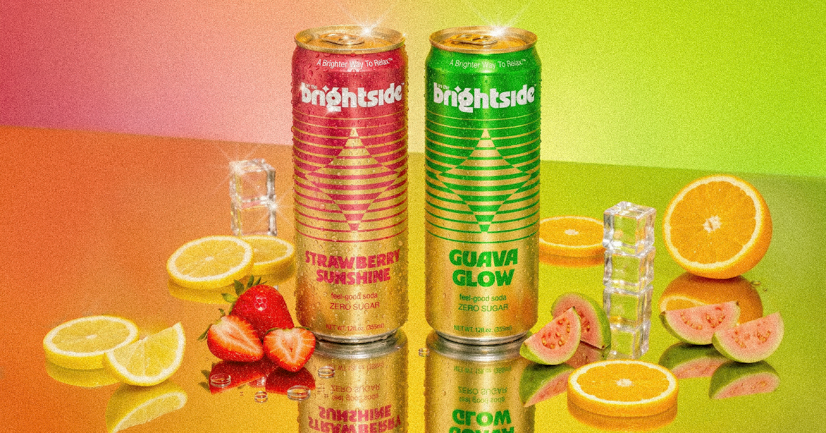
Created by the makers of cannabis beverage brand Cantrip, On the Brightside is a new zero-calorie, zero-THC, zero-sugar functional soda. Available in Strawberry Sunshine and Guava Glow, the 12-ounce sleek-can sodas are positioned as “a brighter way to relax” thanks to the addition of 15 mg of Zembrin, an adaptogenic South African botanical extract. With enjoyable flavor, moderate sweetness, and relatively little lingering stevia character, On the Brightside delivers a polished drinking experience that gives the brand a solid foundation– even if its functional proposition may require some deeper explanation.
Things that stand out:
- The liquid is the strongest part of the whole package. It has a moderately sweet flavor profile and minimal aftertaste compared with many mainstream zero-sugar CSDs. Using stevia Reb M ensures a clean taste and does not overwhelm the drinking experience.
- The combination of zero calories, zero sugar, and 15 milligrams of Zembrin gives it a differentiated position between conventional diet soda and functional relaxation beverages. Yet it’s enjoyable enough on flavor alone that consumers do not necessarily need to buy into the functional aspect.
- The packaging has a distinctive retro-modern aesthetic, pairing bold green and pink colorways with an exposed metallic gold backdrop and geometric line work. The highly stylized Brightside logo and large flavor names give the cans personality and create a recognizable visual system across the two SKUs.
- The “brighter way to relax” positioning feels approachable and upbeat compared with some relaxation products that lean heavily into sleep or sedation cues. Messaging such as “feel-good soda” helps reinforce that this is intended as an everyday, recreational soft drink experience.
Things to consider:
- Zembrin is likely to be unfamiliar to many consumers, and the significance of a 15 mg serving is difficult to understand without additional education. On the Brightside will need to communicate the ingredient’s purpose and expected benefit in a simple way without making the package feel overly technical.
- Some of the front-panel typography loses readability against the reflective gold metallic background. Increasing contrast in key areas could improve shelf readability while preserving the package’s distinctive visual identity.
- The “feel-good soda” descriptor is relatively small compared with the logo and flavor name. Making the soda callout more prominent could help consumers immediately understand the product category and reduce reliance on secondary package copy. Plus, we just like it as a tag line.
- We can’t help but wonder if some more conventional flavors would be a fit for the brand.
Rating: 
To submit your beverage product to BevNET for review, click here. To browse past reviews, check the archive here.