Search across the BevNET CPG Media network including BevNET, Nosh, Brewbound, Taste Radio, Nombase and CPG Jobs.

SprintToSuccess S1E3: From Strategy to Creative
In our last episode you saw our strategy team work their magic. We dug into insights, explored the category, executed consumer listening, and leaned into cultural tensions around whey, up-cycling, and hydration. All of this research culminated into a brand positioning.
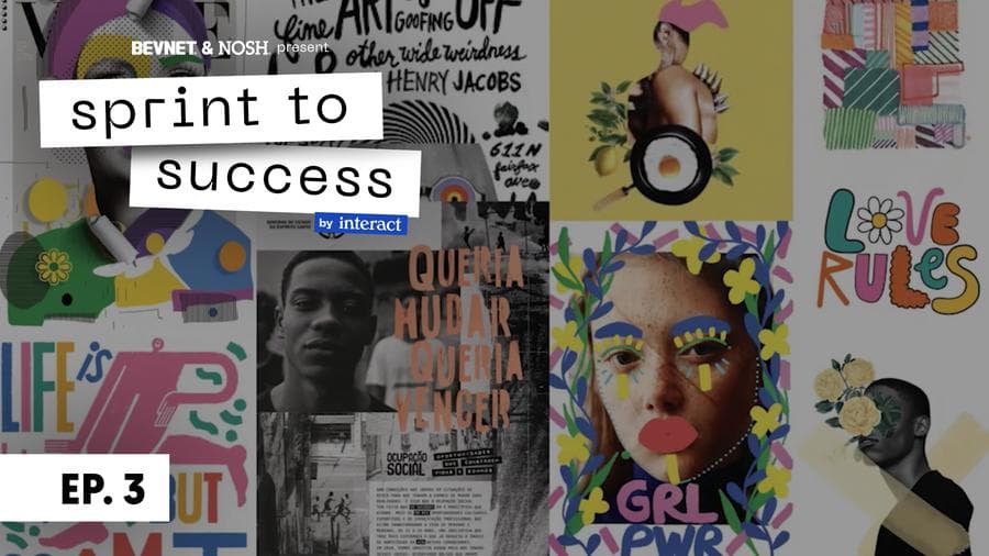
In this episode, we are turning the corner from strategy to creative. We take the strategy and interpret it into two design pieces. First, visual territories, aka moodboards. The goal of visual territories is to take the strategy and come up with a visual language that differentiates us in a way that makes sense to the consumer. After getting Melissa’s feedback, we move into the second piece – designing brand worlds. This includes logo’s, color palette, and typography. The aim of this episode is to nail down the nuts and bolts of what we want Superfrau to look like in the future.
SprintToSucess is a video series developed in collaboration with branding agency Interact Boulder. This show is an exclusive learning opportunity for subscribers of BevNET and NOSH. View all videos in the SprintToSuccess series.
Transcript
Note: Transcripts are automatically generated and may contain inaccuracies and spelling errors.
Speaker 1 [00:08] Well, well, well, we meet again. Welcome back to season 1, episode 3 of Sprint to Success. Now, last episode, episode 2, you got to meet our incredible strategy team, Katia and Whitney, taking us through all of the amazing challenges that faces Melissa and Super Fraud brand and product. Our strategy team dug into all sorts of really interesting insights. They did consumer listening to understand the consumer a little bit better. They dug into the underlying category, they leaned into the cultural tensions around weight, upcycling, and hydration, and then most importantly, put it all together in a brand positioning for Melissa. They also established the brand personality and tone of voice. So in this episode, we're gonna turn the corner from strategy into creative. So here's where we're at in our 7-week sprint process. We're in phase 2, which means we're focused on the brand world and visual identity system. Now, it's a lot of fancy words, what does it all mean? Basically, now that we've finished strategy, we're interpreting that into design. So, today's presentation is actually compiled of two parts presenting to Melissa. The first half of the presentation is going to be going over what we call visual territories, otherwise known as mood boards. This is where our lead designer, Leah, is taking all of the strategy, the understanding of the consumer, and of the competitive category, and asking ourselves, how do we come up with a visual language that differentiates us in a way that makes sense to the consumer. This will be really fun, and we have 6 unique ways in. We presented it to Melissa, and she came back with her 2 favorite visual boards. From there, we started to actually design, and this is what we call brand worlds. This is where we're looking at logo, color palettes, typography. All of these other assets that need to come together to give Melissa a real sense for what the brand's gonna be like, as she leads it into the future. Now, I will say, this portion of the project does not include packaging. That will be episode 4. So today is really gonna be focused on nailing down the nuts and bolts of what we want Super Fra to look like tomorrow. So I'm gonna hand it over to Leah to walk us through her lifetime presentation to Melissa.
Speaker 2 [02:31] So this first one we called Alt punk, uh, which we gave a couple little descriptor words for each just to ground you and what they're about. So, this one we're calling rebellious, energetic, and raw. We really loved hearing you talk about your brand and your current branding on Pack, um, and really want to figure out ways how we can really show this idea of how we look different, um, and you had mentioned. This cool idea like 90s playground, um, being your inspiration for your current packaging. Um, so we thought there's still something really interesting in that world and how we can bring that to life. Um, so in this board, we really wanted to show that sort of energetic feel, um, still keeping with this like layering and block text, um, but also wanted to bring in some things like. These like woodblock linocut carvings that have a little bit of raw. Aspect to them that feel like hand done and have a bit of personality still while still leaning back into some of the things that we're really liking about your current packaging. So this is more of like the close-in option if we're gonna give that an attribute. Cool. So we can hop over to 2. This one we're calling Alpine punch and describing this as bold, balanced, and dynamic. This one is really inspired by the idea of like Swiss design. So obviously your product comes from the Alps and, you know, Bauhaus, even though that's in Germany, but Bauhaus and Swiss design, um, is really all about this very clear communication, um, and we think that there's something kind of interesting in the idea of pulling a design concept or design style that's from a specific area that your product is also from. But also that it sort of allows you to still have some fun personality, but really be clear in the communication of what the product is, um, since there is somewhat of a confusion about what this actual product is, potentially leaning into some clean type, but utilizing bold colors or bold shapes is an interesting way to inform the consumer. So, option 3, we're calling a new path, which is gonna feel fluid, calm, and harmonious. So with this one, we're liking this idea of the fact that our alt consumer is really trying to forge their own path and live their own individual lives and not trying to conform to anything. And we also thought that that was a really nice comparison to this idea of a new kind of hydration. This is a, a different sensation in terms of hydration. It's the sustained idea. So, wanting to sort of connect those two. So all of this fluid motion and sort of visually representing this idea of forging a new path, but also how can we Cue hydration in sort of new and interesting ways leading out from how something like Gatorade or Powerade might do. This one we're calling Soft Rebel. It's gonna feel organic, grounded, and pretty subtle. The biggest inspiration for this one was you talking about this idea of transparency. So we really like some of this like subtle overlay of colors on top of each other, um, as well as utilizing these sort of organic soft shapes. We know that. Transparency within your brand is really important, and since we won't be able to have an actual transparent bottle any longer, there's something interesting about being able to play with that kind of idea in a visual sense. We also think that this sort of like flowy shape idea is sort of counter to what is currently happening in the category and using some of these softer pastel colors. Again, it's not really something that's used right now, but can be a kind of interesting intro for people. This one we're calling Own Your Weird. It's gonna be vibrant, loud, and a little bit kitschy in a good way. So, this one feels like it's the most leaning into this sort of idea of like 90s playground, fun, um, vibrant design. So, we really loved you talking about the like overlay from your text and these bands behind it and how can that sort of come into a really live, lively and vibrant, um, energetic space, um, that feels not necessarily any gender-specific and open to Interpretation for whoever the consumer may be. Definitely out there, a little bit quirky, a little different, but there's some really interesting pieces in this one. And then last but not least, we're calling retro, which is gonna feel nostalgic, friendly, and quirky. So, one of the last things we talked about on our call, I guess it was last week or a few days ago, whenever that was, um, hearing you talk about this idea of playing in like a kind of nostalgic space. We really liked the idea of leaning kind of harder into this idea of nostalgia, so pulling in some sort of mid-century modern type feeling design and Some of these more character-esque places. We think that there's something kind of interesting about utilizing potentially like a brand character or brand mascot, um, it brings it into a really cozy and friendly place that not really any other hydration brand is owning right now. And again, it potentially could help with getting over the hump of understanding what this product is, if it has this really friendly and cozy feel. This is the last one, and then next page will summary all of them for you, so we can pause here and let you give us your thoughts.
Speaker 3 [08:25] Wow. I, I love all of these, and I, they're so good. And I feel like you, you, you guys were able to like, pull out random things that I said along the way. And I also feel like. Until now, because I've been in charge of what we put out there, I've like done a mix of all of these things and been really looking for guidance in how to create more of a cohesive message and like, so I know that picking one will be really important, um, and sticking with it rather than like, dabbling in each, which is sort of what I've done along the way, so I. I really love these and. Each one, I was like, oh, yeah, this is it. Oh, no, no, this is it. So I don't know what to say. I, how much time do I have this time before I have to tell
Speaker 2 [09:23] you?
Speaker 1 [09:25] So what did she pick? Well, Melissa made two choices, soft rebel and a new path. What's interesting about these two choices is they're a little bit of the same ilk, just on a spectrum. Soft Rebel is a really nice board that focuses on kind of organic shapes, quirkiness, a little bit of funkiness, definitely the brand personality coming through in a soft, caring kind of way. What a new path does is it amplifies the energy, which makes sense given that we're a hydration drink. So between these two paths, what we're now going to do is look into Leah's mind around how she turns that into a brand world. Again, a brand world in this situation is where we're starting to develop and design actual pieces of the brand's identity, looking at typography, color palettes, shape language, and as well, starter logos. So let's check out what Leah's got for us.
Speaker 2 [10:19] So we're gonna be showing you 4 brand worlds, so you don't have to choose between 6 this time and only 4. and you'll be seeing a brand world board and then some additional touch points and collateral pieces. It's sometimes hard to like get a feel for what is actually gonna come to life in a packaging standpoint when you're just seeing it in a sort of. Not realistic sense, so we wanted to put it on some tangible pieces, so you would get a little bit of a, a greater understanding. So, without further ado, we will dive into option one. So, in this option we are calling way different. So, I'll read through this little description for you. It's just a quick little brief before we get into the specifics. As much as Superfrau is about whole hydration, we are also about our whole selves. That's why this concept embraced. unpolished edges and textures to exude our quirk and celebrate our differences. Breaking almost all design conventions in the hydration space, this concept lives and breathes unorthodoxy, balanced out by soft colors that extend an invite to join the movement and feel the superpower. This option, you shall, you probably recognize the brand mark here. So, this is our close in, in air quotes option. We really felt as we were going through some different aesthetic territories and playing with some different type options that we still wanted to utilize a sort of like hand done feel and we had tried a couple different uh typefaces and. Went back and put yours into some of the things we were doing and we really felt that your current brand aesthetics really still have relevancy to your new brand personality. So we wanted to keep that sort of authentic and natural feel that that has and just sort of add on it, add on to it and expand upon it. Here is the full brand world for this option. Um, so here you're seeing how the type sort of works with each other. Um, so in addition to just the logos, you're seeing how potential type options can work with each other and how type and color are playing with each other. One important thing we really wanted to do with this option is make sure that we're still utilizing black as one of your brand colors. Sort of feels like it works with a hydration space, but pulling in some of these softer. Uh, tones and pops of color feels like it's bringing it into a new space. We're also adding in this sort of like polka dot circle motif that we really feel like is a subtle nod to cow spots, but also sort of speaks to this idea of water molecules and this sort of vitamin and mineral absorption that the product has. Um, so thinking about potentially using some of the circles like in the bottom left to reflect. Flavor, but also reflect how the um components within the beverage will actually hydrate you. And obviously top right corner showing you some photography elements, really quirky and fun and still exuding your brand. So, here are some of the collateral options for this guy. So all these are going to be the same items for the next 3. So, skateboard, pulling in that pattern and how that can exist in a different way, showing an application for the logo on a t-shirt. Showing how some type can come to life on something like a tote bag, and then an Instagram post example, utilizing some photography as well. So we can run through everything and if you want to stop me at any point with questions, feel free to do that. Um, but I'll just keep, keep hustling if you're good.
Speaker 3 [13:59] Sure, yeah, keep going. I, I love it so far.
Speaker 2 [14:03] Great,
Speaker 3 [14:03] really cool.
Speaker 2 [14:04] Cool. So we'll dive into option two, which is called new movement. So I'll read through this little description, just like our product and just like our target, we're a little wayward. Through winding lines and primary colors and clean fonts, this concept can balance clear information systems while evoking excitement through energetic and inviting shapes and colors. Just as Supervi helps our consumers flow from one thing to the next, this concept helps them flow from internal, I'm sorry, informational benefits to emotional benefits. This concept is really leaning a little bit closer to that athletic side of the spectrum. We really want to sort of speak to a more. Hydration and familiar athletic space here with still keeping some of that cork in mind. So we still wanted to have personality and fun. Um, you can see this in the letter forms of the logo, they're soft, they have some movement to them, um, but utilizing blue and different shades of blue here and as you can see here. More additions of some like sportier colors, so red, keeping some black and white, all of that really leans into this, a little bit more of an athletic space. Here, we're also showing you a brand mark, which is something that you currently don't have for your brand. So this S swirly shape that you can see in the yellow square, that's locked up with the word mark, and you can also see it living in the pink square on the bottom right. Really just highlighting this movement idea for this concept, um. And bringing that back to this idea of hydration. This is really coming from the new path forward. It's like very clear step out from that. And in terms of collateral, we're showing you how the skateboard can sort of utilize some patterning again, how that mark can really live big and bold in the center. And then some additional type and brand. Element movement on a post and on the tote bag. Then let's move on over to option 3. So we're calling rounded out. The rounded, uh, engulfing colors, this concept in this concept nod to the fullness of life unlocked by full hydration, soft organic shapes, and the, uh, serpentile droplet. Did I say that right? Let me read that again. Centropole droplet paired with more crisp, funky colors, funky fonts speak both to the functional and emotional benefit of the product. Moving on. Um, OK, so this option we're really wanting to lean heavy into hydration. So, first and foremost, we'll talk about the brand mark which is above the Superbrow. This mark is really sort of trying to play this idea of like finding your own hydration or find your way to hydration. So, the mark itself is made up of a letter S that crosses over to form a very subtle nod to a little letter F, and in the center of the bottom part of the S is a water droplet. We're really leaning into hydration with this one. So in terms of the full brand board, um, this whole idea is about finding your way to hydration, um, using this really plump looking water droplet to speak to hydration as much as we possibly can. We're sort of pulling in again a little bit more of a sporty color palette. It's pulling some more from conventional athletic feeling colors, but still adding some of that cork. Uh, we're also overlaying the sort of paper texture onto this concept, which feels, um, a little bit more natural, a little bit more authentic, and sort of balances out the really like flat bold colors of these, showing some photography, how you could potentially do some photography styling. Um, and also how we can potentially show flavors and pulling, playing with those water droplets, so they sort of become secondary shapes. And in terms of collateral here, we're showing a skateboard that's letting that brand mark sort of just live on its own, um, and exist as its own piece from the brand, again with the water drop that's creating the negative space on the t-shirt, we're sort of acting as if this is a second brand mark, so they're Leaning against each other in a way that almost creates a letter S as well. And then in an Instagram post showing how, you know, brand elements can sort of come to life to speak to an idea. So being an individual standing out and finding your way, hydrate your way. Last but not least, concept number 4, which we are calling make some noise. With bright colors and bold energy, this concept leans into the cowbell as a symbol of confidence, energy, and joy. The deconstructed exclamation mark creates fluid shapes that signal flow and hydration. This concept allows us to not just exist in our differentness, but own it and shout it from the rooftops. Now make a noise for whole hydration. So, this one is all about owning Super Fro's personality as a brand. Um, we really wanted to make sure we're presenting you something that can really lean into the fun, bright life that you have as a person, but also that your brand can have. So we're really using a super fun typeface here that feels really friendly. And pulling in some of these soft floaty graphic elements that are sort of speaking to an exclamation point idea. Alexis also commented that it could also be udders, but that could just be for us. Awesome. So this is how the full board is coming to life. So, we're really owning a cowbell as our brand mark here. We think it is kind of an interesting way in to acknowledge the origins of your product. And allow it to be a symbol for the personality of the brand and the personality of the person who is actually going to be consuming this, then finding ways in things like copywriting and really interesting tone of voice to then talk about hydration and really make sure that we're connecting it back to the product. Since this is less focused on hydration, we definitely wanna make sure that there's still that balance, um, but we think really owning a personality is a really interesting way in. So, cowbell is a brandmark, pulling in some verbiage like let's get hydrated and ring your bell. And for this one, we're using a navy as more of a brand color, leaning away from black. This color palette in general feels like kind of a modern take on a little bit of a retro color palette. Uh, there's, feels like there's some, um, Like retro vibe in terms of how the type and the sort of bell mark itself look layered on top of each other. Um, And for collateral, we are showing, again, skateboard, utilizing some pattern. We have the bar of the bell, excuse me, coming in slightly from the left or from the right side of the board, um, playing with how that can. Work with these other elements. Um, the t-shirt, we just wanted to show how this really interesting brand mark and brand personality can be pared down to a really simple, just t-shirt graphic. So it doesn't necessarily need to always be living as bold as it is in other areas. The tote bag, again, speaking to products, but how can we speak to our consumer in a really fun, quirky tone of voice. And then this ring for what you need concept for the um. For the Instagram post, potentially finding a way to engage consumers, reply, telling us what, you know, you need to get you through the day kind of thing. So that is it.
Speaker 4 [22:12] I was really impressed with how you were able to bring to life through design, all of our discussions around our target market, the vibe and messaging we're trying to get across, and really tackle head on the challenge we face as a new and unusual concept in the hydration space. It's going to be really challenging to pick just one of the four options presented, but um I know I can't really make a wrong choice here.
Speaker 5 [22:40] So what did Melissa pick? Well, in her own words, it was a tough choice, but at the end of the day, Round It Out was the top favorite. It was approachable, it reflected the brand's personality, and the overall symbolism really struck Melissa as the perfect visual bridge for what this product does for consumers.
Speaker 1 [23:03] And so with that, episode 3 is a wrap. Episode 4 is gonna focus on turning the corner from these great visual territories and brand worlds, and now evolving that and moving into packaging design, the moment of truth where we take all of the strategy and the design and put it in a singular moment that has to compete with other brands. Tune in next time.
Related Videos
SprintToSuccess S1E6: The Finish Line
We’re almost to the finish line! In this episode you'll see the end design result and hear from Melissa about the experience.
SprintToSuccess S1E4: Packaging Design
In this week's episode, you’ll see how we evolve our exploratory designs into the moment of truth - packaging.