Search across the BevNET CPG Media network including BevNET, Nosh, Brewbound, Taste Radio, Nombase and CPG Jobs.

SprintToSuccess S1E4: Packaging Design
In this week's episode, you’ll see how we evolve our exploratory designs into the moment of truth - packaging, or as we like to think of it, the brand-in-hand. This is the moment where all the parts and pieces, from strategy to communication to competing at shelf, come together into an easy and understandable form for the consumer.
We explored two unique ways in and have shared our full concept presentation to Melissa with you to give you insights into how we turn the corner from strategy and visual territories to full blown brand and packaging. Tune in to see if you can guess the direction forward.
Transcript
Note: Transcripts are automatically generated and may contain inaccuracies and spelling errors.
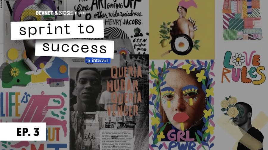
Speaker 1 [00:08] Thanks for tuning in on episode 4 of Sprint to Success. This episode's an exciting one. Last episode, episode 3, you witnessed us turning the corner from strategy to creative for the first time. We did visual territories, another word for mood boards, and we started to develop brand worlds, really looking at the brand identity system, logos, colors, font systems, illustration, pattern work. And now, we really put all of that together in that moment where the brand comes to life in hand. We're all of the parts and pieces, understanding how to connect with the consumer, how to take all of the brand strategy and communication and turn that into a really easy, understandable communication for what the product is, it's benefits, as well as creating an unmistakable brand for Melissa that evokes her personality. So without further ado, we'll head into our concept presentation where we unveil our packaging concepts. This is gonna be led by our lead designer, Leah Cawthorne.
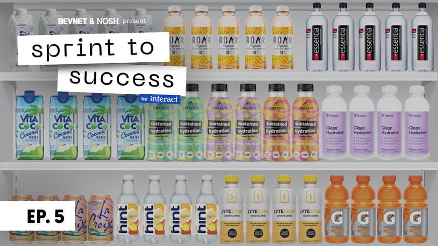
Speaker 2 [01:13] All right, so this first concept is called drop it like it's hot, which courtesy of Fred. Um, so I'll read this little description for you. Feeling like your best self can only be achieved when you are, well, feeling your best, super even. At Super Frau, we believe that the fullness of life must be matched with even fuller hydration. Super hydration for a super you. So, that's what this whole concept is about, this idea of feeling super and feeling like your best self. We wanted to look at some alternate, uh, logo types for you here, so that's what you're looking at right now. We felt like this was a really nice balance of your sort of personality and quirk, while also still being really accessible and Um, understandable from a consumer standpoint. Um, this also has our lovely little droplet hidden in the pea, so we're still getting some of that in there. Um, and we also adjusted the color palette here slightly, so that we're still feeling like hydration and pulling cues from the water set without adding any sort of confusing colors like those pinks and purples from last round. So, here is your updated brand world for this concept. So we are still keeping some of this great language around super hydration and finding your way to hydrate. We're adding in this sort of gritty texture that was in the Uh, first concept from last round, we just think it adds a little bit of that personality and that edge back into it, and again, we're using this really plump water droplet to act as the brand elements. Now for the exciting bit, packaging. This is our hero cube. And we decided for the background for this, we are using this really sort of evocative water color, this blue background, and superfoul also appearing in blue. So thinking that both of those blue tones would act as brand colors, taking you through some of the hierarchy first, we are calling this option super hydration made from whey. So super hydration is really the first thing you're reading, um, and we had a lot of conversation internally about the prominence of whey on pack. So for this option, it's A little bit of a softer prominence, so you're really reading super hydration and flavor before anything else. So whey is just sort of a secondary piece. We are using these two big water droplets sort of floating in from either side to hold both um pieces of information. So this is the, the system that is going to be created where the product information lives up top and flavor living at the bottom. We added in a little bit of flavor iconography to just help make those visual connections between what the flavor is, especially for shopability purposes. And we also really loved about these droplets matching together like this, is sort of feeling like cow spots again, which we're always down for. And in terms of flavor, we are calling this cool as a cucumber lime. So we really want to make sure we're still speaking like our brand and, you know, exposing your own personality. So trying to pull in some little quirky pun feeling stuff in there was really feeling right. And then at the very bottom, Calling out no sugar added as we feel that's really one of the most important callouts for the brand, as we are really pushing against the fact that we are the same level of hydration just without any of the sugar or added sugar. We're also calling out pack of B6 and upcycled whey on either side of that no sugar added callout. Um, and just a note for you, those things can be updated and shifted depending on what you feel is like the most important thing to sell. So moving right along to how this extends out to a second flavor. So this second flavor being when life gives you lemon elderflower, again, a little quirky silliness there, um, swapping out the cucumber slice to the left of the lime for an elderflower next to the lemon. Um, and very consistent system where the bottom drop matches flavor, and we swap the super hydration language to also reiterate that same flavor color, just making the shopability really, really clean and um understandable. We'll move right on here to the shelf set. So, want to take a look at how this lines up against competitors. Um, we really feel like it both looks like it belongs in this set, but also feels like it has its own personality and energy. Um, there's a level of movement that is happening on PAC, which is really interesting compared to some of the other competitors that are pretty stagnant. And we really love that that flavor droplet on the bottom is really creating a nice center point for the brand, um, and calling you to the center of the aisle. On page 19, we're taking a look at how a first example or first exploration of full layout might look. So, all the information on the right boring stuff is all FPO for right now. We will update that as we go along. Um, we want to take a look at what the language can, uh, how the language, excuse me, could come to life on the left hand side of the pack. So here we're just talking about hydrating the super way. Calling out the better for you elements of this product. It's it naturally has lots of calcium, electrolytes, B vitamins, and it's good for your gut. And then talking a little bit about the alpine story and the upcycle story at the bottom, Fresh Whey, and Alpine Best Kept Secret is light and refreshing, super is a light and refreshing super hydrator typically discarded by the tons in the US, and that story can obviously be elaborated on. Um, and also one last element on the full layout is adding a little bit of a bug on the bottom left that will match up with any perforations that the printer adds to help educate the consumer on how to properly recycle this. So peel this off so that you can recycle. So it's a really important element for us to keep in there. So, page 20 you've seen similar guys to this last round. Just wanted to show you how these elements will come to life on skateboard, on a tote bag, and in a potential Instagram post. And then that Is it, and we'll head into option 2, if you're ready. Unless you have any other questions or wanna chat about anything.
Speaker 3 [07:49] That looks great. I'm ready for peak hydration.
Speaker 2 [07:53] Great. OK, so #2, called peak hydration. At Superbrow we celebrate our differences, sing out our corks, and ring cowbells for our weirdness because when because being your true self is living at your peak. We make hydration that pushes you to the summit and helps you on the descent. Join us and feel the superpower. Super. So, still using your uh OG logo here, which we're really, really loving, we wanted to find a mark that matched. You the quirkiness and personality that the Super Frail logo or your Super Frail logo has, um, while still connecting to the product in a more clear way. So we, you know, internally liked the S mark that was from last round, but as we were thinking about it more, it felt like there was something lacking in terms of how it was actually connecting back to the product, and this didn't feel like it was speaking to the brand as much as it was to the product. This mark is a combination of this alpine summit and comes together in the center to make a water droplet. So, really speaking to the alpine hydration here, and that's really what this concept is about. So here's how this brand world comes to life. So, the pattern that is existing behind this when life gives you lemon elderflower, it's actually a pattern that we created from the logo, as well as some of those smaller brand elements that iconographically. Brand elements that were existing on your side panel of your current packaging. We feel all of that is really a nice complement to this really impactful, powerful, clean typeface. It really gives that edge and that personality that I think you're looking for, for your brand, um, and that we also feel really matches our consumer base. So now to packaging. Here's how this one is coming to life. So, One of the things we all loved about your existing packaging, aside from your puns, is the use of black and white, and we feel like that is such a strong element to your current brand, and we wanted to find a way to highlight that, but also use it as a leverage point and the fact that nobody in the space is really utilizing black in a high duration sense that isn't overtly performance based. So, We are using black at the top here to house our product information. So walking you through hierarchy, at the very top, Super Frau logo, then underneath you'll see that brand mark Alpine peak, you know, alpine hydration mark, that is really creating a visual tie between the actual explanation of the product, which we are calling on this option, alpine hydration. So again, going back to our conversation on how much prominence we should have or deserves on PAC, we think both sides of the argument are essentially valid, that we need to inform the consumer what this is, but The piece that was missing when whey was the first read was explaining what the product is and what the product is doing for you. So now that we're calling out alpine hydration, saying powered by whey is connecting it to the actual function functionality of the product. So, there is no speak of protein, so there is no confusion in that sense. Top half is explaining product, and then at the bottom. is where flavor color comes in, this super frail pattern exists to get a little bit of that edge, a little bit of that personality, um, and flavor names live on top. Again, cool as a cucumber lime, adding some of that quirkiness back in, and pairing this sort of funky wavy typeface with this really, uh, bold, solid cucumber lime typeface. And at the very bottom here, some callouts, again, no sugar added in the center. On the left, upcycled for the planet, and on the right, our sort of placeholder made up 10 times more electrolytes call out, which we don't know is actually true. So feel free to let us know on that. Great. So, taking a look at how this extends. So, black is your brand color here. Black and white exist as holding the brand and holding the information system. What switches out is the bottom third of the pack, which is holding flavor information. Page 26 is how we're taking a look at the competitor set. So, this one is undeniable that it pops on the shelf. There is no other competitor that is owning black the same way and owning this really bright pattern paired with black. You know, roarer above you does have some funky patterning, but they're keeping it clean with the white background. Um, and hint doing a similar idea.
Speaker 4 [12:57] Just to add on to what Leah was saying earlier about the communication hierarchy, you can get a little bit of the alpine hydration read here, but the way because it is an outlined font really does fall back. Um, so it's kind of nice that from a distance or when you're standing, uh, 1 to 3 ft away, the hydration aspect comes forward first.
Speaker 2 [13:20] Thank you. That's a good point, friend. On page 27, we'll take a look at how this extends to a full layout. So, on the left hand here, we are talking about both the alpine story and a little bit of the bringing in a little bit of the upcycling story. So, sound the cowbells. We are the best kept secret of alpine farmers for decades, fresh whey. Sadly, whey is discarded by the tons and In the US until now. Superrou is taking this not so ordinary waste and harnessing its naturally packed vitamins, minerals, electrolytes, and happy microbiome goodness to help you rehydrate. What else could you ever want from a beverage? We aren't nicknamed the alpine cure for a reason, for no reason. So really talking about the alpine story here and bringing in some of that upcycling story as well. And then on the bottom left hand of this design, we are including another way to communicate how to recycle this product, um, with an additional like reiterated instruction panel. So in the strip it says peel this way to recycle, added pun there as well, and the paper coil is an actual graphic that would be printed and printed in between the actual pole tab of the Um, shrink wrap, and then in the little tab on the bottom it says help Superfrau keep our planet super by correctly recycling this bottle. Peel off the shrink wrap, then toss in a recycling bin. So, Recycling is a really important aspect to the life cycle of a bottle, but it is hard to communicate and educate the consumer on how to properly recycle certain things. So, the fact that you're owning, potentially owning really clear communication, not only adds to your brand, but also adds to just helping the planet in general, which I know you appreciate. So on page 28, again, just taking a quick look at how some of these brand elements come to life on skateboard, tote bag, and Instagram. And That is it. Yeah,
Speaker 3 [15:23] can I just say thank you for putting super fragilistic in there.
Speaker 2 [15:28] Yes,
Speaker 3 [15:30] Exalidosis.
Speaker 2 [15:32] Super fragilistic.
Speaker 3 [15:33] Yeah, and these expialidosis at the bottom.
Speaker 2 [15:37] Definitely in tiny letters
Speaker 4 [15:39] on the other side of the bag.
Speaker 2 [15:41] Oh yes, nice.
Speaker 3 [15:46] I have enjoyed every minute of this creative process. I think that, um, Getting to, first of all, I live and breathe this stuff all day long, and, and being able to talk to people that seem to understand me and what I'm going for, and that have been able to take some of these, like, crazy thoughts that just float in my head, and then not only articulate it beautifully in words, but then Create these images out of it and, and really take a feeling that you have and, and then attach what it would look like in real life and that connection is just so powerful and You know, at the end of the day, these are like, it's a drink, so it's like, it's not life changing, it's, it's not going to, uh, heal the world, um, but it could make a big difference in uh outdated supply chain, and what's really important is that people pull it off the shelf. And try it, and, because otherwise, it doesn't make any difference in the supply chain. And so, that's what I've been. Really hoping to achieve through design and I, I feel like you guys really thoughtfully nailed it, um, in terms of, you know, taking a step back. All right, let's, let's look at who your target market is and then, you know, let's look at, you know, what, what's their need? How do we fit in there? How do we speak to you? What language resonates, what visuals resonate, all of that stuff, you know, I could never do on my own and I know. Getting, getting, getting to do this in this, um, sprint to success is, you know, it's just an incredible opportunity. So I've really liked it, it's been really hard at the same time because, uh, I, I needed like little, I don't know, rockets on my sneakers, not just regular sneakers, but But, uh, you know, we'll, we'll take a look this weekend and, and dig deep again and it's the, the, the challenging part for me is, uh, You know, It, it really forces you to, to focus on, on what it is exactly that you want and, and, you know, when you're doing this alone and, and going a million miles an hour, you, you kind of never take the time to, to do that. You're, you're, you kind of assume all those things and so I, I just, the, the opportunity has been really great to dig deep with you guys and, and see all your creative minds. Come together to present such beautiful stuff. So
Speaker 1 [18:45] there you have it, our initial work for Melissa and her first reactions. Now, as she went back with her team and thought about things over the weekend, she landed in the same place. Peak hydration is the concept we're moving forward with. Now, if there's anything you get or take away from this episode, we hope it's this, that packaging is greater than simply designing on a bottle or a box or a wrapper. That is this moment of singularity where the brand comes together in one place, but performing multiple jobs. You have exuding the brand personality and the overall ethos and the vision of the founder, you have ensuring that it differentiates from its competitive set. Ensuring that it's resonating with your intended consumer and audience, as well as promoting clearly the product benefits. And so putting all of this into the singular place is really an art and science. Now that we've got a good roadmap in front of us, we're gonna go into the rounds of revisions for episode 5. This will be where we take feedback from Melissa, her team, as well as from ourselves internally, and can continue to evolve this brand to be as great as possible. So stay tuned and watch how things move.
Related Videos
SprintToSuccess S1E6: The Finish Line
We’re almost to the finish line! In this episode you'll see the end design result and hear from Melissa about the experience.