Search across the BevNET CPG Media network including BevNET, Nosh, Brewbound, Taste Radio, Nombase and CPG Jobs.

SprintToSuccess S1E5: The Art of Revisions
It’s been a while since you’ve heard from us, but don’t worry, we’re still going strong, thanks to the hydration of Superfrau. In our last episode we presented two packaging design concepts to Melissa. After much deliberation, the team as a whole decided to move forward with “Peak Hydration”.
This episode is all about the art of revisions - moving from a big conceptual picture of the brand and into the details that can make all the difference at the moment of truth aka getting a consumer to choose us. So from a design standpoint, this means continuing to evolve communication hierarchy, fonts, colors, composition, flavor systems, claims and more.
Now, as in life we, took a few detours on this sprint. As we moved through the rounds of work, we realized that we were seeing the brand differently than Melissa and her team. We also understood that there were opinions we weren’t hearing that Melissa was having to consolidate and deliver. So to put thinks back on track, we gather Melissa and her group of advisors for a call and walked everyone through the work and thinking. This gave us the ability to hear everyone’s thoughts and create a plan moving forward that addressed everyones POV, ours included.
So as you work on your own brand, remember that it’s important to listen, stay nimble and bring everyone along for the ride. Having an open mind and the flexibility one needs to be a good partner is critical to in order to create something with true intention. So check us out and tune in next episode to see what the final product looks like!
Transcript
Note: Transcripts are automatically generated and may contain inaccuracies and spelling errors.
Speaker 1 [00:10] Welcome back, everyone.
Speaker 2 [00:12] New episode? New background This is episode 5 of Sprint to Success, revisions. Now, it's been a little while since we last met, and we'll be sharing what we've been up to over the last 2 weeks, but episode 4 of Sprint to Success was our initial concept presentation to Melissa, where we unveiled our brand identity and packaging design for Super Fro. Now, we provided two very distinct directions to Melissa, droplet like it's hot and peak hydration. And after much deliberation with her team and with us as our agency partner, and looking back at the strategy and the visual territories that we took her through, peak hydration ultimately was the selection to move forward. Now, this episode, like I said, is about revisions, and revisions is a very critical point in the process with a design partner, where you've got the right footing, but you've got to figure out how to continue to evolve all of the other pieces along the way. We're talking things like communication hierarchy, color, typography, fonts, brand systems, all of these things coming together for that critical moment with the brand in hand. And so in this episode, we're gonna walk you through the last 3 rounds of revisions that we've been doing internally with Melissa. Now, no spoiler alert here, but at the end of the episode, we're gonna share some big takeaways from this overall process. Oftentimes, continuing to evolve the work is as much about the partnership as it is about the design. And we're gonna give you guys some takeaways from the detours that we've actually taken along the way in our sprint to the finish line with Melissa and her team. So, with that, we're gonna be very transparent through all of this, and I'm gonna hand it over to our lead designer, Leah, to walk us through how the work has evolved over the last 3 rounds. Take it away, Leah.
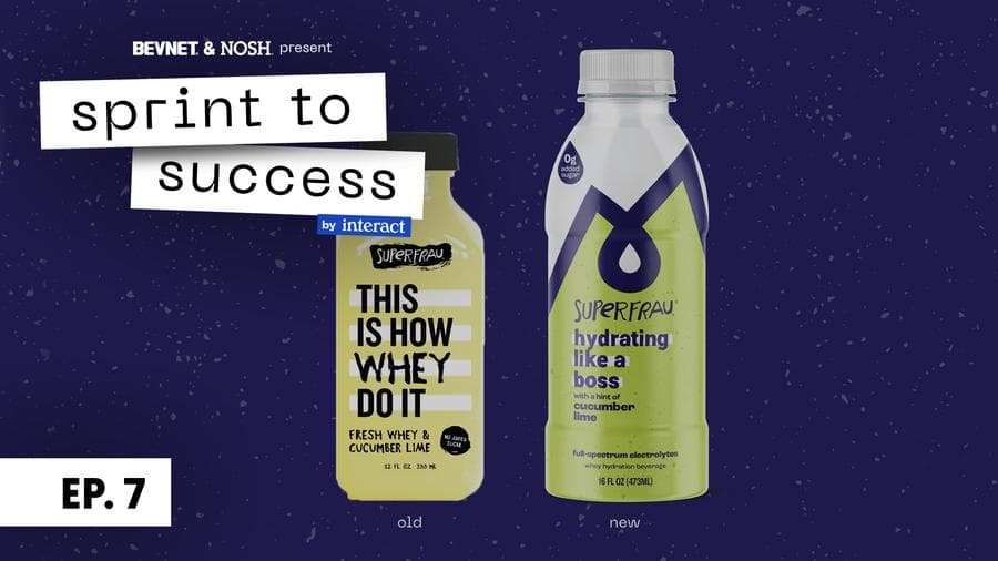
Speaker 3 [02:16] OK. So in the last round, you guys saw Melissa select peak hydration as the concept to move forward with. Though there was a lot of love for both of these, uh, she felt as though peak hydration was closer into how she wants this brand to evolve. With that, there were some caveats. She felt like there was a lot of intensity around the black, and how the black was being paired with this, these dark colors for flavor, and how the coffee was coming to life, really bold in the center. was feeling maybe a little bit too corporate, uh, maybe a little bit too commercial. Um, and she didn't feel like it was hitting the mark just yet. Uh, there was some love for the, uh, droplets on option one and some of how we're building out the information system as well, so. We wanted to take a look at some alternatives for opine hydration, um, and push a little bit further on how this brand comes about. So I'm gonna walk you through the two rounds that followed this. So in round two, we showed Melissa another two options. Now, these were all rooted in the same brand board that you're seeing here. Um, So we really wanted to make sure that we are pushing this into a space that felt closer into Melissa's personality and what the brand personality is as well. So, there was some hesitation around the intensity of the flavor colors, so we really wanted to bring those in uh a lighter, softer space and have them be a little bit more evocative of what the product actually tastes like. We were also taking a look at how these pieces were coming together, um, and how we're actually Referring to the product on the pack as well. So, here is option A. Um, for option A, we took a look at how we can really blow up this pattern background. I feel like that was really embodying the personality of Superfro, um. And tying in this color system with the logo mark as well. In terms of communication here, we minimized alpine, um, and making it sort of a callout referring to the actual product descriptor that we chose for this route, for this option to be sustained hydration, um, so we're calling it alpine inspired sustained hydration boosted by whey. Sustained hydration, we felt like it was a really great way to tie in actually what this product is doing for you and how this is different from any of the other hydration beverages on the market, be it a coconut water or some sort of electrolyte replenishing water. This is sustained hydration. It really is explaining what it is. You're getting hydrated throughout the day, um, so we want to take a look at how that was feeling, um, Because that is a really big piece to attract consumers, that living big and bold through the center, and down at the bottom, boosted by way underneath living the flavor names. So, still keeping in some of the fun, quirkiness, cool as a cucumber lime, when life gives you lemon elderflower, and then practice what you peach mango. Still being silly and fun and bringing in some of those dad jokes. So we take a look at the shelf shelf set for this option. Um, we really liked the touch of black here. Uh, we know that Melissa was feeling a little bit hesitant around leaning so, so heavy into black. So having it just as a touch with the cap and then through the center, feels like it really draws your eye in and it's still pushing against um some of the main competitors on the shelf as well. So here's option 2. The option two, because there was some love around this droplet, we really wanted to try to make that work. And we also wanted to, although we know that Melissa was feeling some level of hesitation around black, we felt like there was a way to do it that felt right and pushed category, um, and still felt like it was super brown, still felt cool and funky and fun. So again, this pattern is living throughout the background, it's a really, really subtle tone on tone on the black background, and then within this droplet per flavor, it switches out for flavor color. Another thing we took a look at here is what we're calling this. So, Melissa also had some love around the term super hydration as opposed to uh alpine hydration. So here we're laying into super hydration, ties it back to the brand name, and we're then saying powered by upcycled whey. So really leaning into that upcycle messaging and allowing that to be part of the main read of what the product is. There's some love on Melissa's side and our side about really leaning into the upcycle messaging, and we think that that would be a really nice hook for our consumer. So making that be part of the main communication was an interesting thing to take a look at. And then just minimizing the call-outs at the bottom, no sugar added, seriously, uh, and obviously flavor living. Similarly to last round, utilizing some of our silly dad jokes again. Taking a look at this on the shelf, uh, obviously, this is really intense and vibrant compared to everything else. Um, the black is pushing real hard against most of the other competitors, but there's still some fun and funkiness seeing this big colorful droplet in the center, um, that draws you in and makes it seem like it's something different and something interesting, which it certainly is. Uh, so, taking a look at how these two are comparing with each other, and how they both are pulling from this main brand world. We can see that they're obviously different but still drawing on the same pieces, but ultimately, Melissa was feeling like option A here was the winner. The black was just feeling a little bit too intense still, um, and wanted to minimize that and also, you know, maximize this flavor experience and this color experience. Alright, so now I'm gonna walk you through round 3. So, as Melissa gave us some feedback on option two, we realized that we were Leaning a little bit too hard into the flavor experience of this product, and it was feeling a little bit too intense still, a little bit too vibrant. Um, there is no sugar in this product, and Melissa and her team were feeling like there was some sugary sweet aspects from the color palette that we're choosing, um, and it felt like an overpromise or a little bit of a confusing point when purchasing this product. So, uh, we really wanted to take another stab at stepping back and looking at how this flavor profile can come to life through color and also communicate what the experience is drinking this product. It's something new and different and we really wanna make sure that our consumers are aware of what this is actually gonna taste like and be like. We also heard from Melissa that some of the communication on Pack was feeling a little bit too uh confusing and not necessarily as clear as she wants it to be, so. Again, regroup with the team, discussed, and we will be walking through where we netted out with these. So we're gonna be seeing 4 options for this one. But Each two have similar, uh, the same communication systems, it's just color and backgrounds that are changing out. So for option A, you are seeing the first communication system, and reading through top to bottom, obviously superfra and our alpine mark living up at the top. The communication then reads, alpine inspired super hydration fueled by fresh whey, with a hint of cucumber lime, and at the bottom, no sugar added. And on the left, upcycle for the planet, on the right, full spectrum electrolytes. So, We had a conversation with Melissa around the experience of this product and um even though we loved our fun and quirky names of, you know, Cool as a Cumber Lime, we felt like specifically calling out that there is a hint of this flavor, uh, may be the right way to go. Um, so we chose to Tone that down a little bit and lean into this idea of a hint of a flavor. Obviously, another big difference here is how we're treating color in reference to flavors. So, the background of all of these is getting this really nice refreshing blue color, um, that we feel like connotes both water, um, and refreshment, and then we're still keeping this really cool brand pattern, but toning it down a little bit and almost treating it as if it's a sort of a tone on tone on this light blue. So, It's not nearly as vibrant, and the actual colors next to themselves don't feel like they're vibrating as much. It's a little bit softer and it's, it's feeling a little bit more light and refreshing. One of the other pieces of communication that we thought was really interesting that we wanted to start pulling in here was this idea of full-spectrum electrolytes. So aside from this being a sustaining level of hydration when you drink it, There's actually all, I believe it's 5 types of electrolytes in this beverage, naturally. So whey has all of these vitamins and minerals naturally in it, uh, and we really wanted to make sure that we were highlighting, highlighting that fact because it really is a point of difference. And we also wanted to call out that this is made by, made with fresh whey. There's some confusion obviously around whey, so we're wanting to really refer to it as what it is, which is fresh, it's a liquid, it's not a powder, it's not a protein powder. Taking a look at this on the shelf, these black bands still really feel like they're calling you to the center and drawing you in. You're getting super hydration as the first read, um, and, you know. Wondering what that product is and then going in for more. Um, and there's something really nice about this almost texture that the pattern is creating when it's a little bit lighter on top of this blue background. Awesome. So for option B, all of this communication is exactly the same as option A. Only difference here is trying to pull in a slightly different color palette. So, Another point that Melissa had brought up to us was the idea of the fact that this really is a natural product, it comes from a natural source, and Where when we were playing with black and some of these really vibrant colors, it felt like it was pulling too far away from a natural beverage. So for this option, we took a look at instead of black, navy, uh, obviously blue still calling a little bit to water, and then with this option for the background, we chose to look. Take a look again at this cream color, which we had actually been using in Drop It Like It's Hot from round one. So, matching those with again, these sort of sophomore pastel versions of flavor color, felt like it was, again, more textural than it was, a big intense pattern, um, and utilizing this cream color. The team felt like it was kind of an interesting nod to our dairy roots without being too overtly dairy. And now we move on to the shelf set for this one. So again, Really nice bug in the center that's calling you in. Um, the pattern feeling a little bit more textural and almost a little bit of movement when it's on this lighter color now. I'm still feeling like it's different and exciting on the shelf. For option C, now we're taking a look at a different communication system. So C and D will reflect each other in terms of communication. Uh, the only differences here being, again, color. So, reading through this communication system, it is slightly different here. We are calling it full spectrum electrolyte super hydration. So, As I said before, this piece of communication around full spectrum electrolyte, we felt like it was Potentially another ad in terms of why somebody would buy this. So choosing to pair that with the main product descriptor up at the top and locking that all together in a holding shape felt right and felt like it was one clear sell as to why this is different and also why this is better. From there, underneath we're saying made from upcycled fresh way, again bringing in that upcycled story into the main brand communication, and Underneath, we're going back to some of our funkier roots and still calling these cool as a cucumber lime, when life gives you lemon elderflower, practice while you peach mango. So, bringing a little bit more of that fun in that cork here, and then at the bottom, still saying no added sugar in the center. On the left, upcycle for the planet, explaining that upcycle fresh way a little bit more. And then on the right, we're saying all day sustained hydration. So giving a little bit more context as to what full spectrum electrolyte super hydration means and what that's actually gonna do for you. And then for color on this one, again, we're taking a look at this really nice refreshing blue color. And with that pattern overlay almost as like a tone on tone. So the blue creating almost like a water texture vibe in the background, uh, which we thought was really interesting. Um, and then at the bottom, just really clean, crisp flavor color, making sure that you're aware of what flavor you're purchasing, really clear distinction between all three. Taking a look at this on the shelf, we think having this brand block of this really great watercolor texture background. is really nice and tying the brand together. You're still getting a clear read of what the flavors are, but having that blue throughout all three flavors, uh, tying everything together. And then last but not least, option D. So again, same communication, only difference here is color. So, removing black from this one, leaning into that navy, feeling a little bit more natural with the background having a cream color on top of white, and again, felt like a really nice nod to our dairy roots, and Giving a little bit more of a clear cell as to what this product is gonna taste like. There's a little bit of a lactic taste to it and it's almost a little bit sour, but still it's really light and refreshing, and we felt like pairing this cream with the white. I felt like it was a, a nice way to explain what the flavor experience you're going to have is. And on shelf, I mean this really clear navy block in the center, um, draws your eye in, you're seeing super hydration, nice, big and bold, and then the really clear communication between each flavor. And then here's how we nutted out with this last round, so. Option A and B, similar communication, C and D, as those two similar as well, uh, and then just playing with some really soft and refreshing colors here. So, here's a quick look at How, where we've been for the past two rounds. So, all the way on the left, you're seeing what Melissa's current bottle looks like and just a view of all the evolution from the first concept round to where we currently stand. So we think it's really nice to be able to reflect on where we've been and where we are. Um, it's pretty nice to see some of the colors from option 1A in the first round, drop it like it's hot, uh, being brought back and, uh, used for round three, as well as seeing some of the separation in color banding as we did for peak hydration in 1B. Now being brought back for round 3 and C and D. So, taking a broader picture of where we are, you can see that there's been some really nice evolution here and we're really liking where we're hanging out. So after we presented round three to Melissa, um, we got to a bit of a crossroads, uh, and even though we all were feeling really great about how things have been progressing, um, We realized that there was a little bit of a miscommunication between our team and Melissa and her team. This happens. It's just a matter of making sure that we are all on the same page and also a matter of just, there are different ways to solve this problem, you know, that's really what we're trying to do is Find a solution for a problem. And on Melissa's original packaging, even though it's really awesome, he was not communicating with the brand, what the product was, um, and not necessarily communicating exactly who the brand was. But there are different ways to do that. And Melissa and her team felt like. There was actually some confusion around having super hydration be the big read, the first re unpack. Uh, they felt like not being able to see Superra as, uh, much as you're seeing Super hydration, that people might confuse the name of the brand with the product name, and people might think the brand is called Super hydration, and they were really feeling like the best way to bring somebody in to pick up the product is with a really dynamic and compelling design. From the beginning, the team felt like that is a way in, but because there's so much heavy lifting with communication, we wanted to sort of make a distinction on whether, uh, the best way to do that is through a really dynamic design, close to maybe what one A was looking like, drop it like a top. Or something like 1B where it's really about communicating in words what the product is. And we sort of got down this path and, and landed somewhere where Melissa's team felt like none of these were as compelling as they thought they should be to call in our consumer and, you know, ultimately that is their decision and that's their POV and we have to work around that and find a great way to solve the problem. So, from here, uh, the team. Didn't go totally back to the drawing board. There was still a lot of pieces that Melissa and her team were really liking. The communication, the actual words themselves felt right, just the hierarchy and uh level of impact that different pieces had was feeling like it was maybe uh incorrect, and things needed to be shifted around. There's a lot of love for this alpine mountain brand mark with the droplet, and they felt like that was being minimized a little bit, and maybe that was a way to Show how the brand can be this dynamic hydration beverage. So, the pieces were there, they just weren't being utilized in the right order. So we, again, went back to a bit of a drawing board and played with some pieces and uh hopefully found a great solution.
Speaker 2 [21:37] Now, as you can see, the team has put in a ton of work to continue to evolve and push Super Frau forward. Now, unfortunately, not everything goes according to plan, and that's all right, as long as you're able to be flexible and open-minded. We sat down with Melissa at the end of that last round of revisions and came to the conclusion that something was amiss. We were feeling some hesitancy and a lack of confidence around where we were netting out. And upon digging in further, we realized that Melissa was in a tough place. She was trying to corral a whole host of stakeholders on the other end of the process that we never got a chance to talk with. So after realizing this, we decided to bring everyone together in one master call, where we walked them through exactly what we've walked you all through, where we've started out in the process, what the strategy was, what the visual territories were, where the initial concepts landed, what the feedback was and how we continue to evolve those into the rounds of revisions, so that everyone could be on the same page. Now, alignment is critical in partnerships, and so is communication. And there were all of these back channels that Melissa was having to deal with, and then turn herself into a funnel and try to articulate that to us. Now, not everyone's strong suit is directing creative work and vision. So what we did was, again, we sat down with everyone and had a conversation around what's best for the brand. Melissa has some smart folks on her side from different incubators and such, so we really started to pose different questions. The strategy that we had at play was to be education forward. That with a product that was as new as it was in a category, with a unique proposition of way, we needed to focus on what this did for the consumer first, and then let them feel the brand as sort of a secondary component. But a lot of Melissa's team was on the other side of the fence, that they really believed design needed to draw the consumer in, and then we would educate on a secondary level. And so after much back and forth, we aligned on this more design forward aspect. Something that was a little bit more iconic of a brand, something that captured you visually, from a distance, first and foremost, that had a focal point. And then drew you in with education and information afterwards. So, one of our core philosophies is that we're building a car for the entrepreneur. If the entrepreneur isn't comfortable driving it, Then we've built it without a true intention of letting them lead the way. So, What we've then done is delve into a new round of concepting, so to speak, really revisiting all of the assets that we've created, pulling them off of the canvas of packaging, and figured out a way to put them back together. That will be the next episode. So the reality is, we're not gonna finish sprint's success in the seven-week timeline, and that's OK. Good partnership is all about communication, flexibility, and understanding on both sides of the table. So we're adding one week to our run time. And that making sure that we cross the finish line in the right way to give Melissa the brand that she needs. To focus on how to improve the communication and overall to get her to fall in love with her brand again, as well as make the agency proud here at Interact. So, with all of that said, stay tuned as we continue our sprint and learn along the way.
Related Videos
SprintToSuccess S1E6: The Finish Line
We’re almost to the finish line! In this episode you'll see the end design result and hear from Melissa about the experience.
SprintToSuccess S1E4: Packaging Design
In this week's episode, you’ll see how we evolve our exploratory designs into the moment of truth - packaging.