Search across the BevNET CPG Media network including BevNET, Nosh, Brewbound, Taste Radio, Nombase and CPG Jobs.

SprintToSuccess S1E7: What's a Pretty Package Without a Roadmap?
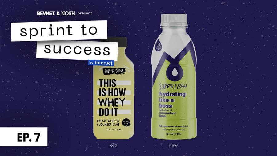
Well, a good package (design) always needs something to tie it together. In this final episode, we show you two final key components. The first component is the Brand Style Guide. It’s basically a roadmap that shows the entrepreneur and their vendors the rules and principles of the brand, i.e logo lockups, brand colors, etc. The second component is the production of the mechanical file. This involves talking with the printers, creating mechanical files, and proofing.
As we hand off our final files to the printer, our portion of the project is complete. We’ve handed the baton to Melissa who is still running towards getting the final product on shelves. Follow along and get updates on a launch @drinksuperfrau
Transcript
Note: Transcripts are automatically generated and may contain inaccuracies and spelling errors.
Speaker 1 [00:10] Here we are, our final episode of Sprint to Success, episode 7. If you joined us for episode 6, we showed you the finish line, exactly what the redesign of Super Fro looks like. And while Melissa's super excited and our work is seemingly done, it's actually just the beginning. In this episode, we're gonna break down two final key components of any good work with an agency, and that is building the brand book to hand off to the entrepreneurs, so that they know how to drive this brand new vehicle themselves. And then on the opposite end of the spectrum, working with the printers and the people that are gonna actually execute the things that we've worked so hard to design. So you're gonna be hearing from Valerie, our head of production and sustainability Interact, as she walks us through a lot of the key things entrepreneurs need to understand when they go to print, and you're gonna be hearing from Leah one last time as she walks us through how the brand has been put together, the rules, the principles, and the way it should be used. So let's check it out.
Speaker 2 [01:18] So this is all pretty straightforward. And we can like run through this. This is more for you, and just being able to understand how this works, so that if you want to bring new people onto your team, you can use this as a guide to help them understand the strategy, um, as well as just understand how the brand comes together, unpack, um, and you can use some of these bits and pieces for future use as, um, you're creating social media posts, swag, any of that stuff. Um, so feel free to stop us at any time and chat through things. If you're confused, we wanna make sure that you're fully understanding how all of these pieces come together. Just to start, we have our beautiful renders. Then from there, just obviously table of contents. So how we break this down is who we are, which is gonna be all of the strategy information that you've already seen, um, just broken out a little bit differently and branded for you. Um, how we look, which is all of the brand related information. So how do the logo lockups come together, how do they work for social media, etc. Um, and then putting it together is just how the actual pack, um, gets constructed. So if you do ever do flavor extensions, that would be a great place to start to send somebody to look at that and then extend from there. Um, and then we have some information just to help you. Decipher how you want to put together some photography pieces if you ever do some campaigning or anything like that. So we'll jump right into who we are. I'm not going to read through all of this because you have seen and read this a million times, but this is the brand purpose. Our Whelp we're different. We have our brand foundations, our why, what we provide, and how we do it. A little bit about our alts and a little bit more specific into who that those alts are that we're targeting, starting to target in the beginning. And then who is Super frail, just a little bit of your persona and your voice. And that's it, all straightforward. If you wanna read through these. After this meeting, we send them to you and there's anything you're confused about or think we, you would like us to elaborate on um Depending on what our round situation is, we can look at for that for you. Um, so yeah, let's jump into how we look. So, primary wordmark, so our Superfrail logo was carefully crafted to embody our brand personality and character. The hand-drawn custom wordmark with its rough texture, mixed weights, and mismatched case represents our quirky and lighthearted personality and voice. Um, so just showing you how it can exist in. On a dark color on white and then white on a darker color. Bottom left is just showing you the minimum print size. So, this is not related to uh anything digital. This is specifically if you're getting anything printed, business cards or whatever. You just don't wanna go smaller than 1 inch wide. The logo mark. Our Super Fra Alpine logo mark provides flexibility to our brand system and serves as an alternative mark for use on social media, swag, marketing communications. It also serves as the main artwork on the packaging application. Then again, just minimum size down at the bottom for future use. And then here's the different lockups that we have. So, obviously, you have seen the two at the bottom because your original, and then we're showing you a third, and this is your primary, which is locking up the mountain and the actual word mark itself. Some social media icons. So, we gave you a handful of different choices here. Um, we are suggesting number one, most likely, um, just because you're really able to see the brand as, you know, see the brand words, the brand type, um, much more clear than maybe the, the sky and the mountains, obviously, you're not seeing the word super fro, but there is, you know, we're suggesting potentially using 2 and 4 for something like Instagram. Um, where you're able to sort of have people connect the mark to the brand when you're going through stories or stuff like that. So, feel free to choose whatever feels right to you to start out, um, and you can always swap them out as you're getting into it. Logo misuse, this is all pretty straightforward. You're not gonna do anything insane, so we don't need to worry about this. Here are our typefaces. So, the main typeface is Ramona and then Rock grotesque are for the supporting headlines and stuff like that. So, Ramona should always be used for headlines, never for body copy. Um, it's usually accompanied by the white band behind it, doesn't always need to be, but that's how most cases are situated on the pack. Um, and then rock grotesque and extra bold and medium. Medium is mostly for body copy, um, but both can be used interchangeably for subheads, um. On pack and off of pack as well. And Rock Grotesque is an Adobe font, so we will talk to you more about licensing for the typefaces and how to get all that uh once um we have Val get involved a little bit more. And then brand colors, super frail blue, we'll give you the Pantone and then all of the other information you need hex codes RGB and CMYK um. If you're unfamiliar, RGB is for digital, hex code is also for digital, and then CMYK is for printing. It's just sort of semantic-y things, but just so you're aware, um, if you are getting something printed and the printer asks you for, you know, your Pantone or what the color is and they're not using Pantones, you wanna give them the CMYK numbers over the RGB. Flavor colors. So, the three flavors we're showing to you. Um, we have the main color up top and then the color that is in the little speckled pattern in the background has an additional Pantone, just a darker version of the above. And again, we didn't, we don't have them here, but if you are ever looking to extend your flavor colors, we just ask that you're trying to keep in line with these sort of tones and um obviously maintaining a good level of contrast with the darker type, all of that jazz. And that's that for the how we look section. Now we'll take a look at putting it all together. So this is a lot of copy on the left hand side. We are not gonna run through every piece of information here, um. It's just, we want to make sure we're giving you as many details as possible for when you do hand this off to somebody or if you do, at some point to extend what all of these pieces are doing and we go into more detail on, you know, what typeface this should be set, what size this should be set in, what typeface, all that jazz. So, we'll also be handing over final artwork, of course. So, that is a great way to build off of um where you're currently at as well. And then here are just some of your brand world examples. I always want to be utilizing our super fun, quirky tone of voice, trying to implement our logo mark in interesting ways and sort of treating it similarly to how it's unpacked. Addressing, we should be addressing and encouraging all walks of life. Super proud doesn't stand for fitting in or being typical, uh, neither do our alts. We want to make sure we're speaking and acknowledging our audience and make sure they're understood, which you know all that. And then for social media, we're showing you some examples that we think are really great for. Embodying how Super Frau is going to come to life in a photography stance. So, who are the types of people that are going to be drinking Super Frau? What are they doing? How does this photography actually look? So, really nice, beautiful, natural light. They look like real people. They're enjoying their day and, you know, doing everyday activities. Don't want to be super performancey or have any sort of like, crazy athletes, you know, participating in any sort of Gatorade type photography. For keeping it Casual and feel like the right type of vibe for our brand. And then that's it.
Speaker 1 [09:57] So as you can see, the brand style guide is a really important leave behind. It's essentially the roadmap or the user manual for the brand, for the entrepreneur, and for anyone that's gonna be a part of the brand moving forward. Now, let's get into the very, very important part where we have to bring it all to life in production. So I'm gonna hand this off to our head of sustainability and production, Valerie Hawks.
Speaker 3 [10:24] Hi, I'm Valerie, and I'm the head of production with Interact Boulder. I don't normally show up to this branding and packing party until the very end of the process. I work with both the artwork that our lovely designers have created and the printer to ensure that our files are set up correctly for the printing process and the substrate that are being used. In this case, we're printing on a shrink sleeve using a flexigraphic printing process. In printing for packaging, we're usually using one of three printing processes digital printing, flexigraphic printing, or Rotogravier printing. I don't know if I pronounced Rotoruvire correctly. Rodegravire. Digital printing processes create images by depositing toner directly onto a surface, while flexigraphic printing processes use a rubber or plastic plates to press ink onto the substrate. Rotogravier technology is similar to flexigraphic printing, but it uses large cylinders to deposit the ink rather than plates. The decision to use a specific printing process is generally based on the quantity that is being produced. Digital printing is used on the smallest print runs. Flexi graphic printing is used on medium to large runs, and Rhoda Gravira is used on very large print runs. Roto Gravire produces really amazing quality really quickly, but it's expensive, and you have to have a large amount to justify using that print process. Flexographic is really good. It's not always perfect, but it's also fast, so it's a great alternative to Rotogravi if the numbers are smaller. Well, my job is generally the last stop for the design train. I do jump on at the very beginning to chat with the printers to confirm our print specs. I'm wanting to know how many colors we can use. The amount of colors is based on the amount of color stations a particular press uses. In the case of Super Frau, I know I'm limited to 8 color stations. I'm also asking early on what the color of our substrate is. If our substrate is clear. As is the case with this particular label, I know that I'm using white as an ink as opposed to as a substrate, and it will count as one of the colors that's being used. This is important early on because I need to let our designers know to design within these parameters so that we're not creating something that can't actually be produced in the end and that then we have to backtrack and detract from the colors that we've used in a design. I'm also wanting to find out um things such as the minimum text size that this particular press can handle to make sure that all of our text will be legible. The printer will generally give this information for both positive and reverse type. Positive type would be a dark color on a light color like black text on a white background. A reverse type is the opposite. We have a light color on a dark background. Positive type can usually be one point smaller than reversed, but it's important to know the specific guidelines for the printer that you're working with. When I received the artwork from the designer, I'm going to create a mechanical file. The name mechanical dates back to the early days of printing when typeset text and images were pasted onto an actual sheet of cardboard and photographed. While everything is digital now, we still use the term mechanical. It basically means that the file is cleaned up and only contains what is needed to print. Let's take a look at the super frail mechanical file. When I received the file, the first thing that I'm gonna do is go in and look at all the layers. In this case, I've already cleaned them all up, and you can see over here on the right that we have the interact Mc flag layer. The Mc flag is a mechanical flag that I'm putting into the file every time I create one, and it lists out all the information that is pertinent to the printer, the dimensions, the type of label, and the colors used. We also have a layer. That shows you the technical aspects of the file. These are gonna be your dimensions, your folds, scores, etc. and I make sure that all of those are on their own layer and they're labeled do not print. The dye line is its own layer. Our FPO layer, FPO means for place only. This is gonna be for any element that's in the file that is not finalized. Either the client's gonna be dropping this in or the printer may be dropping this in on their end, but we wanna call out that this is not final so it doesn't accidentally print. It's on its own layer and the FPO is created with a color that is also not printing and is labeled do not print. We've then separated out our artwork as well as our background. I wanna make sure that the file bleeds, so the background here. Comes out beyond the dye line in the areas where there can be ink. This is so that when it trims, no white, um, or clear edges sneak into the design. All presses have variations of how close to the trim line it can actually cut, and so we wanna make sure that the artwork bleeds off the edge so that it never trims inside of it. We've left this area over here completely blank. This calls for it and says that this is a no ink area, um, standard of the process. So I go into the colors and I clean all of this up. I make sure that what is listed in here is only what is printing. We also have this section of the dialing colors, the FPO, and the McFlag colors. So the colors that are used in our Mc flag up here are listed in their own folder so that the printer knows that none of these are supposed to print. Up here we have our white, or black, in the pantons that are being used, as well as a screen of black that is being used in this shadow over here. This color, when I received the file was originally built with a 4 color bill. That means that there were 4 colors that were used in this shade. A lot of times that's referred to as a rich black. In this case, because reflex a graphic printing, and each color is laid down. Separately, one at a time, we actually don't want four colors to be used. It could accidentally take on a tint of more cyan or more magenta, so it was best to go in and clean this color up and remove all of that extra colors and just keep it as a screen of black. This ensures that it looks gray and it looks like a shadow and it doesn't become bluish or yellow or magenta. We're only using Pantones, so these are based on lab builds that we don't adjust. I, let's see, so we fixed all the colors, we made sure that the bleeds are correct, we made sure that everything's separated out on clean layers. I do a quick spell check. Um, to make sure, obviously nothing is misspelled, a lot of times with packaging, we have ingredients and words that aren't gonna come up in a spell check, so I need to give it a good eye and make sure that everything is looking exactly how we want it to look. I also will go in and I will look at um Spaces. I wanna make sure that there are no accidental double spaces used, and I can do this by turning on my hidden characters, and I can zoom in and I can see, OK, these are all single spaces. I don't want any accidental double spaces sneaking in here. Similarly, I can use this time to look close at the text and see if anything needs any fine tuning with the current. or the leading, um, I'm looking through the NFP, which is the nutrition facts panel, making sure no double spaces snuck into that again, my spell check isn't gonna find phosphorus or some of these words, but that's OK because I'm looking them over. And everything looks good. Once I'm good with how everything in my file looks, I'm gonna create a PDF and I'm gonna send it out to our team to prove. When it comes back to me in its final final, I'm gonna package this all up in Illustrator. When I package it, it's going to include any links and any fonts. And the native file, and that's what I'm gonna send off to the printer. I'm also gonna create a version of this illustrator file where I outline all of the copy. This is so that if the printer doesn't have the font, nothing is accidentally um changed because if they open it it may replace a font if they're missing it and we don't want that to happen so I send a version that's outlined and that's generally what they print from if there's something that they need to change on press, they do still have the editable file and because I packaged it, they also have all the fonts. That's pretty much it. We send it off. Um, it's not done, done though because we need to see proofs because we're not printing on something as simple as paper, we rarely get to see actual printer proofs on the substrate. They do usually send us a PDF proof, and that will show um the colors used and if we're doing any codings in this case, as we can see in our in our MAC flag, we're doing a matte coding flood that means it's going over the entire thing. And they'll usually indicate that in a printer proof of where that matte coding is going to be. In this case, it's overall bit. So that pretty much sums up this final stage of our branding and packaging process. I've created a mechanical file, I've sent it off to print, we've approved a proof, and now we're just waiting to see it on the shelf in one of our nearby stores.
Speaker 1 [19:41] And just like that, we've ended our first season of sprint to success with Melissa and Superfro. Now while we've crossed the finish line together, she still has a marathon in front of her. All entrepreneurs know how true this is, and we couldn't be more excited to watch her go out and win her ultimate race. Now. Interact Boulder has super privileged in bringing you all this series, and we hope that entrepreneurs all over watching this have gleaned some important insights that they can take and work on their own. At the end of the day, what you're talking about is building a partnership and bringing different levels of expertise to the table. On Interact side, all we do is work in the food and beverage industry. We have an insane focus on helping our clients understand the best practices of branding, of strategy, of positioning, of design. But it's nothing without understanding the entrepreneur's vision, without understanding the entrepreneur's drive, their personality and how to pair those things, and ultimately create the perfect marriage. So thanks for tuning in this season, and we hope to see you
Speaker 4 [20:48] next.
Related Videos
SprintToSuccess S1E6: The Finish Line
We’re almost to the finish line! In this episode you'll see the end design result and hear from Melissa about the experience.
SprintToSuccess S1E4: Packaging Design
In this week's episode, you’ll see how we evolve our exploratory designs into the moment of truth - packaging.