 Across oversaturated retail shelves, bev-alc brands are under pressure to stand out.
In premium spirits and canned cocktails, brands have learned that calling out unique ingredients and connecting to audiences through their own cultural stories is key to positioning. They’re also balancing bolder looks with conveying brand values, health benefits and taste without over-messaging. Many have gone back to the drawing board, honing their brand prepositions and packaging.
Standing Out In The Cold Box
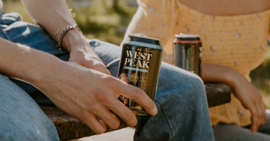
At Santa Cruz-based West Peak Sparkling Spirits, founders Nick and Jamie Sanyal took a beat after some initial learnings at independent retailers to refine and redesign, aiming to make waves by infusing California’s coastal culture into their newly re-designed brand.
The husband-and-wife team launched the brand in 2022, hoping their combined backgrounds could create a winning premium canned cocktail line. Nick Sanyal has spent his career in natural CPG, with stints in supply chain at UNFI and white label food manufacturer SunOpta, and later as an investor and head of supply chain at Sweet Earth Foods, which sold to Nestlé in 2017. Jamie Sanyal brings e-commerce experience from tenures at eBay and leading PayPal’s global experiential marketing.
West Peak’s carbonated lineup ( 6% ABV) spans spirit bases: Tequila Paloma with red grapefruit and sea salt; White Rum Cooler made with yuzu citrus and ume plum; Vodka Punch with passion fruit and lime; and Vodka Spritz made with blood orange and bitters.
Amidst the many RTD brands that have targeted outdoor occasions, West Peak is aiming to own the post-ski, surf, or skate session, collaborating on organic social media pushes with local pro surfers and skateboarders, many of whom are their friends’ kids or surf buddies.
After a year of learnings as they built inroads into independent retailers, the couple decided to rebrand before embarking on a geographic expansion. One big realization? In aiming to appeal to the rebel adventurer and differentiate from other beachy brands, the black and gold 12 oz beer cans felt rough around the edges to consumers.
“We [originally] deliberately wanted to have different packaging than what we had previously seen on the market as far as the tall, skinny white can and the pastel colors, but I think we almost went too far in one direction,” said Jamie Sanyal.
The big design challenge? Appeal to a broader audience while keeping the vibe of Santa Cruz’s gritty and adventurous spirit. They also learned they needed to provide consumers with more information on the liquid’s unique ingredients.
The new packaging, in the same 12 oz can and colors but with new typography, amps up the flavor cues. The ingredients are on the front, with a colorful rim highlighting the wellness attributes: gluten-free, 6% ABV, real fruit juice, 130 calories, and low sugar (two grams). It also hosts a new tagline: “Crafted by rebels, savored by legends.” The where-the-mountains-meet-the-sea topography illustrations also provide some softness, decorating the front and back, and there are written callouts to the brand’s homebase.
The brand’s expansion strategy aligns with that aesthetic: Along with targeting more chain retailers, West Peak has partnered with Olympian skier Jonny Moseley as they set their sights on California ski resort areas like Mammoth and Tahoe.
“Making Our Consumer The Hero”
While West Peak is facing a market now sporting the 3,000 and growing wine- and spirit-based ready-to-drink (RTD) items, other brands are learning how to stand out in more traditional categories.
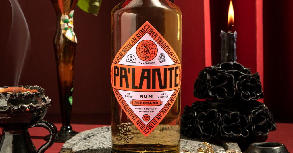
For Pa’Lante Rum, its updated labeling reflects a deeper understanding of their brand and consumer, according to the founders. The brand is marketed towards Latin American immigrants and children of immigrants, who, like CEO Eric Zurita and co-founder Eimi Ramirez, want to see their cultural traditions reflected in a premium product. After working in spirits and beer, Zurita launched his own rum made in Mexico but distilled in a Cuban tradition.
“Initially, we leaned in on highlighting the underrepresented rebellious nature of Latin American heroes by making them the tattooed faces of our different products,” said Zurita. “Even though that’s still a great story, we shifted to focus on making our consumer the hero while telling the product story.”
The founders wanted to focus more on capturing a sentiment often felt by the Latin American diaspora: “We are neither from here or there, which points to a feeling of alienation and not really belonging anywhere,” said Zurita.
To lean into that duality without tropes, they created new illustrations of mythical creatures on the bottles that reference “the beauty of existing in this in-between world of duality.” Names of the product SKUs also shifted from English to Spanish, which typically isn’t seen in rum, with terms like blanco, reposado, and añejo more often used in agave. Instead of explaining Latin American heroes on the back labels, the new back labels get more into product specifics.
Pa’Lante hired The Young Jerks, a branding and packaging studio that’s also worked with non-alc Parch, Sunday Beer and coffee liqueur Mr. Black.
“We wanted to make sure it not only didn’t look or feel like anyone’s preconceived notions of rum, making it feel new, but also letting people who didn’t know the brand know it was rum,” said Dan Cassaro, partner at The Young Jerks.
Being Good Looking Isn’t Enough
As brands refine their approach, Cassaro acknowledged that they risk “over-messaging.”
“I understand the impulse to announce what makes your beverage special in a crowded market but when done in desperation it can kind of have the opposite effect,” he said. “Consumers definitely care about functional benefits but not at the cost of clarity or confidence.”
Being good-looking isn’t enough — just like in real life — he said, but the real magic trick is when companies can convey brand values, benefits and taste without over-explaining.
As opposed to other CPG industries, Cassaro said that spirits brands will often have to reckon with a longer visual and branding history.
“As packaging designers we all have to reckon with the fact that most people think tequila is one color palette, and whiskey is another color palette, and so on,” he said.
But that can be a fun problem to solve, he said: breaking out of a category, changing what something looks like, all the while consumers know exactly what product they’re getting.
Phreshly was able to achieve that with its revamp, arriving 18 months after the ready-to-drink cocktail launched in 2022. The company went back to the drawing board after a survey of customers and retailers revealed the need for a stronger front panel spotlighting key ingredients, and for the can to connect with the founder’s story.
Since its relaunch last November, co-founder Paul Owusu said the rebrand has effectively presented Phreshly as an elevated experience built on the founders’ culture. That’s helped win placement at a number of hotels – including at on-premise venues and in-room minibars – where the packaging is now more on-brand, he said. The plan was to refocus their sales strategy on their home market of Georgia, and the brand has sold 1,000 cases in Atlanta in the last 120 days.
“Overall, the rebrand has been a hit,” he said. “Consumers know exactly what they are looking at when grabbing Phreshly on shelves and bar menus.”