Review: Ugly Energized
Covers Products: Berry, Lemon Lime, Peach, Pink Grapefruit
Energized is Ugly Drinks’ first major line extension since the brand’s launch just over a year ago. The product marries sparkling flavored water with functional ingredients typically found in an energy drink.
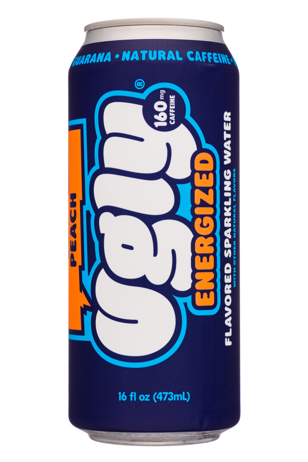
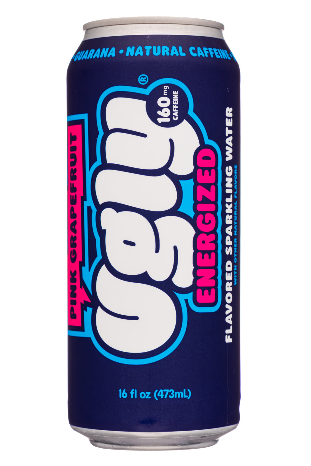
 The line is launching with four flavors, including Lemon Lime, Berry, Pink Grapefruit and Peach. All four have zero calories and contain no sweeteners and are fortified with 160 mg of organic caffeine (from guarana and ginseng) and B vitamins. It’s a product line that’s reminiscent of Hi-Ball’s Sparkling Energy Water, but with positioning that feels a bit more skewed towards the sparkling water category.
All four flavors have an enjoyable taste, with the key difference between this and Ugly’s flagship line being a bit more intensity to the overall flavor and a slight functional note to the finish. If we were picking favorites, we’d go with Pink Grapefruit and Lemon Lime, which we think benefit from having a sharper flavor thanks to the citrus notes.
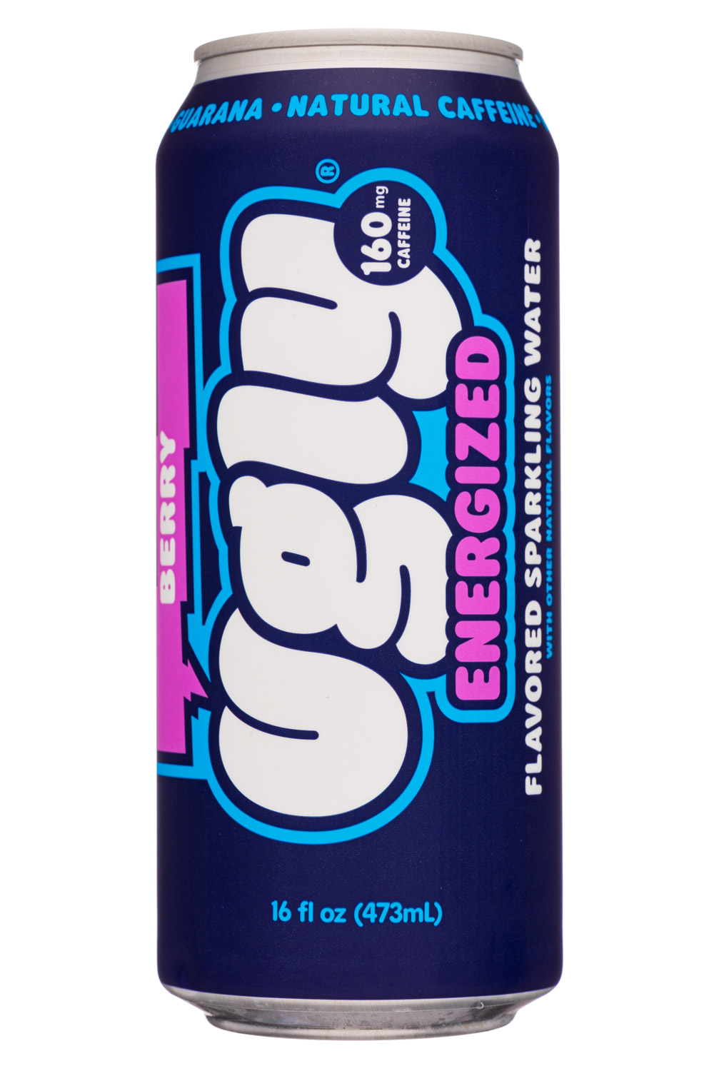
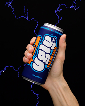
On the outside, they’ve wrapped the 16 ounce can with a midnight blue shrink sleeve that very much looks like a sibling of their flagship line of flavored sparkling waters. The center area, which is oriented vertically, features the white Ugly logo as the hero element. Flanking on the left is a chat bubble-style callout, which lists the name of the SKU, while to the right you’ll find the word “ENERGIZED” and “Flavored Sparkling Water.” Finally, on the back you’ll find the tagline “Get Real, Get Ugly” in large print.
The design is definitely loud and busy, but we think it should be eye-catching and generally intuitive for consumers once they turn the can on its side to read it. And, much like its flagship product, we think the brand has a fun and innocuous look that sets it apart from much of the energy category.
Compared with its caffeine-free counterpart, Ugly Energized has a stronger visual presence. Some of this is due to the simple fact that the larger can will stand out more than the smaller one, but also because of the brighter colors used on the Energized line.
Beyond that observation, we have two suggested refinements. First, we think there should be a callout for “zero calorie” on the front of the can. Second, we think that the “160 mg of caffeine,” which is in a circle placed on top of the Ugly logo, is a bit of a visual distraction. Since we wholeheartedly believe in presenting the caffeine content up front, we wouldn’t remove it. Instead, moving it, perhaps with a callout for “zero calorie,” down to the small print at the bottom of the front panel (where they’ve placed the required can size information) might be a good solution.
Minor suggestions aside, we think Ugly Energized is a very nice addition to the brand’s portfolio. This well-executed line is visually attractive, tastes good and helps the brand expand the breadth of its offerings.